In this task, I will compare the models of practice between a large-scale industry and a much smaller design agency. I decided to research DixonBaxi. DixonBaxi is a global branding and design agency founded in 2001 by Simon Dixon and Aporva Baxi, with its main headquarters based in London, whilst also having additional offices all over. The company specialises in brand strategy, identity design, and creative direction for large international brands. Since its founding, the agency has built a reputation for creating bold and innovative branding for companies in technology, media, sports and entertainment.
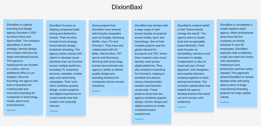
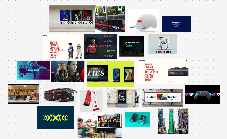
A smaller independent studio, such as DixonBaxi, works with smaller teams with professional directories listing the company as having between 11 and 50 employees. DixonBaxi operates with a relatively small core team but works with specialists, freelancers and production partners when needed. This approach, therefore, allows DixonBaxi to remain flexible while still being able to work on large international branding projects for major global clients. Their branding work for companies such as ITVX, TNT Sports, Hulu and AC Milan all show a strong focus on visual identity, storytelling and a bold art direction.
In-house teams and independent studios operate differently, but both involve strong collaboration throughout. In-house teams such as Nike work directly within the brand and have a deep understanding of their audience, identity and long-term goals, which allows them to produce consistent campaigns across product launches and social media/global marketing campaigns. Roles within the in-house teams usually include brand designers, marketers, photographers and project managers, whilst independent studios such as DixonBaxi are usually much smaller in the number of team members they employ, yet will still have all the same roles as an in-house team. Team members take on a large range of responsibilities within both in-house studios and independent teams, with designers contributing to concept development, art direction and client communication, just to name a few. The creative directors help with guiding the project throughout the development stages, making sure the concepts are exactly what the client has described and asked for.
Understanding the client & context: Classic Football Shirts
When researching Classic football shirts to try and understand them as a brand and service, I found that their whole culture and values are based on this idea of nostalgia and reviving historic shirts and moments, which have been left in the past, giving the chance for younger generations to experience all these historic players and teams. CFS specialises in selling all different types of football memorabilia from a large range of clubs, players, national teams and eras, with their best sellers usually coming from classic and vintage shirts. Alongside nostalgia, CFS core values also consist of originality, rarity and the idea of celebrating overall heritage within the sport.
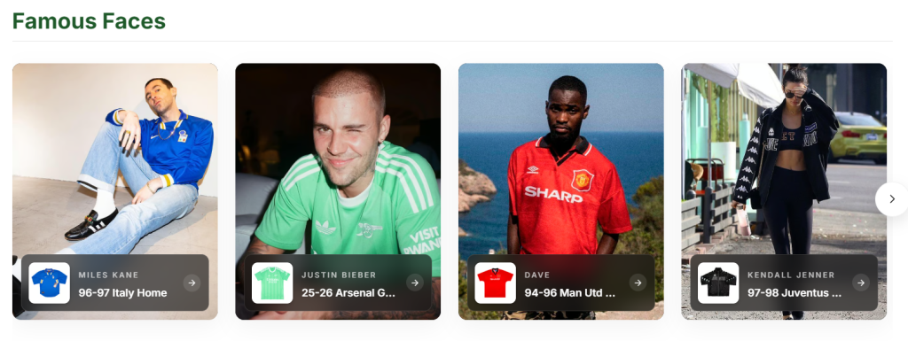
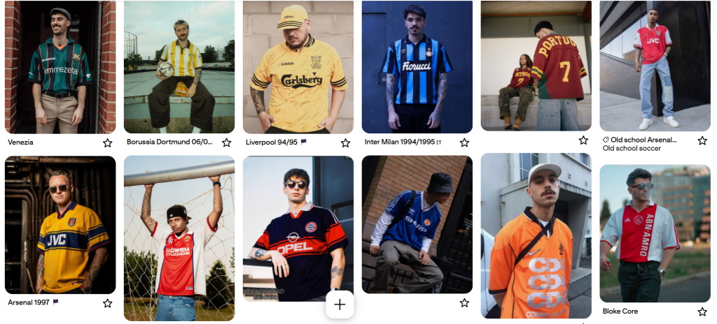
In my opinion, the general target audience for CFS ranges from football fans, collectors and a teenage demographic. In recent years, wearing football shirts has become more of a fashion choice, helping to widen the overall target audience and increase the demand for football shirts as a whole. With certain shirts no longer being associated with a club or a national team but instead as a style, for example, the Brazilian national team’s shirts. On the classic football shirts homepage, they include a section called “Famous Faces”, a gallery presenting celebrities wearing a variety of classic shirts, backing up this idea that vintage shirts are becoming a fashion choice and have this celebrity validation.
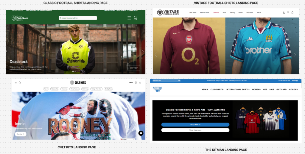
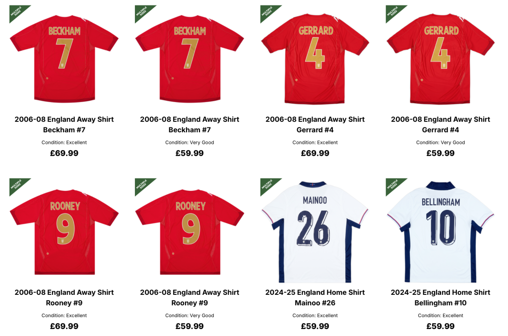
Visually, across the CFS home page, they are consistent throughout by using the same green and white colour scheme for each page and product available. These choices of colours therefore allow the products to easily stand out when scrolling through, with the multiple CTAS also noticeable due to colourcontrast, reducing any confusion or distractions navigation-wise. Additionally to this, the overall visual brand of classic football shirts is what I believe separates them from their competitors. When researching CFS competitors such as Cult Kits, Kitman and Vintage Football Shirts, from the first glance of these web pages and overall visual identity, it’s clear that the choice of brand colours isn’t a great visual representation of their brand and the service. The colours were inconsistent, whilst mainly focusing on darker shades such as greys and black, which, in my opinion, is not a clear representation of sport or this idea of nostalgia, displaying these competitors more as a fashion-focused brand rather than a football-focused brand. Because of this, CFS gains a much stronger advantage through its intentional sporting visual style, standing above the rest visually and building a stronger connection with the target audience. Other visual language that Classic football shirts portray well is the photography for these kits across the webpage, their photography style is quite simple but intentional. All the shirts across the website are laid out flat, which allows for the full design to be shown without any editing or intense lighting used in the photo shoots. Giving the impression that what you see is exactly what you’ll get, which is important when selling vintage shirts, because the customers need to clearly see the condition and overall quality of the shirt prior to purchasing. Overall this provides this authentic feel to the brand, building on this customer trust and relationship.
In the recent years, there has been a strong revival of football shirts, especially 1990s and 2000s football culture, with retro kits becoming popular not just among football fans but as a mainstream fashion choice and street wear. Personally, I think is due to celebrity drive and validation, which I previously mentioned and the inclusion of the celebrity gallery Classic football shirts home page, with artists such as Justin Bieber and Stormzy often wearing vintage shirts a concerts helping to advertise these classic shirts as every day fashion rather then sportswear. Major sporting events such as the upcoming 2026 World Cup also help to drive and reinforce this idea of an emotional connection to a specific kit or tournament kit, also increasing the cultural value. Due to the celebrity validation and desirability of these vintage shirts, classic football shirts and other vintage football shirt stores experience a rapid growth in overall sales and interest with their products, helping to expand from niche collectors and fans into mainstream retail. This shift from sportswear to fashion style positions the brand as both fashion pieces and collectables.
There are clear opportunities for growth for Classic football shirts, especially as interest in football culture and vintage style continues to raise in global attraction. one of the opportunities for expanding in my opinion is moving beyond simple product listing and start advertising more story driven content with the shirts listing, Classic football shirts already do this occasionally but I believe for story telling is an important aspect regarding vintage shirts. By highlighting the history behind specific shirts, iconic players, matches or tournaments, this then helps to create more of an emotional impact and connection with the target audiences. However with the sudden rise and interest of this type of product, Classic football shirts has a large range of competitors such as Cult Kits, Kitman and Vintage Football Shirts, which offer similar products, often at lower prices too whilst also appealing to similar and younger audiences just like classic football shirts. At the same time, major sportswear brands such as Adidas and Nike are also capitalising on this sudden rise in nostalgic and vintage range by rereleasing a number of retro kits, which may also reduce the demand for the original vintage pieces in the perspective of classic football shirts.
Concept Development
Initial ideas and concept development
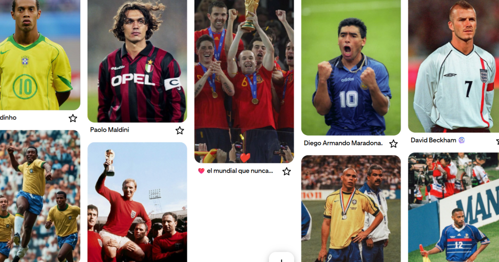
My initial and early concept work for the classic football shirts brief focused on nostalgia and historic players/moments throughout the timeline of World Cups. Rather than advertising these shirts as products, I wanted to showcase each item alongside the history, reliving the moments that come with these shirts. I was inspired by both legendary players and captains at World Cup tournaments, important players and figures such as Maradona, R9, Beckham, Maldini and Iniesta, just to name a few. All of these players individual qualities and moments are what have made certain shirts instantly recognisable and desirable. My approach of nostalgic players and moments was about aiming to connect shirts with storytelling whilst also attracting new target audiences, such as younger generations and collectors.
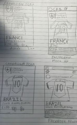
During these early stages for both the webpage and mobile page, I began this process by sketching out how these pages would appear and work, to understand how the brand could function and appear across these different platforms. Whilst also making designs and social media mock-ups, centring these mock-ups and social media posts about iconic players who have played in the World Cup, for example, one shirt that I have made both an Instagram and Facebook mock-up of is the France kit, mainly the France kit with Zinedine Zidane on the back. I wanted these visuals to appear and come across as authentic, while still including the idea of storytelling/ reliving history in all of these posts and concepts. I believe that I achieved this with my concepts through the use of clean yet simple layouts, bold typography and a refined but also relatable colour palette. Because of this, the overall tone of my campaigns and concepts came across as both a heritage focus and a retail focus. For both the concept design and Figma development stages, I used bold Montserrat typography, influenced by several Nike campaigns in which they use this large text across some of their work. This choice of font especially works well when used for both the website and mobile page, as the boldness is perfect for both readability and professionalism across multiple pages. The green and white colour palette across all aspects of the webpage and mobile app allows for the shirts themself to become the focal point of the different pages, especially on the products card, which showcases all the pinned items.
Collaborative workshops and meetings with the marketing students in my group helped to really define how we were going to tackle the brief, which helped with setting us up for the overall direction in which we were going to tackle the tasks set. Peer feedback and constant mind mapping also played a big part in reaching the outcomes we aimed for, with the main idea about nostalgia and iconic players and captains, first being discussed whilst in a group meeting with the other students.
Teamworking
My group and I all discussed a range of ideas in how we could take this assignment forward, but ultimately we all agreed on a campaign based around the idea of turning football shirts into stories, this direction therefore allows for new and existing target audiences to discover these iconic moments, players and national teams rather than viewing products as just items for sale, it provides classic football shirts with the opportunity to build on this connection with the target audience through the use of story telling. This direction also meant that we were focusing on discovery, such as what makes certain kits historic/desirable, instead of relying on persuading the audience to want to purchase an item. Using iconic players and shirt history helps create an emotional connection with a particular tournament’s shirt, such as Brazil’s 2002 home shirt or the France 2006 home shirt. This direction also offers the chance to those younger generation fans, or new fans of the sport, to relive these past moments through storytelling.
The feedback I received from Alec and Ash when I brought in my early concept work highlighted the importance of appearing authentic and trustworthy to the target audience while also staying in line with the classic football shirt visual brand identity. The feedback on my concepts, designed during the sessions, was positive from both, and gaining the client’s positive feedback was important to me, as it gave me the exact direction to take for the rest of the brief. Knowing the clients were happy with the work shared and produced so far helped to make the overall process as smooth as possible. Feedback from the marketing students was often really positive, with them agreeing and being fans of the ideas and concept I would show them during our weekly meetings. Working with the marketing team meant that I was able to tailor my designs for certain platforms or target groups due to them constantly sharing data with me, such as the best social media platforms for engagement or the current trending players/ shirts. Meaning I had to refine and decision make all my concepts weekly to ensure I was up to date and on the same wavelength with my group.
Design Responses
This stage of the project focused on developing my draft layouts and other prototypes across a range of different platforms for classic football shirts. I have developed initial layouts for Instagram posts, website home page concepts, and mobile apps. All these early drafts were themed around the idea of World Cup icons and captains.
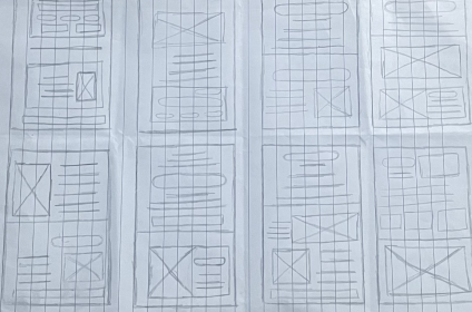
Prototyping was an important part of the design process, especially during the wireframe development stages, whilst also helping to visualise how users may react with this campaign. I sketched and developed low fidelity wireframed so that I could then establish key aspects such as structure, navigation, and the hierarchy, with the higher fidelity mock-ups including the typography, imagery and colour examples. The website prototyping focused more on navigation menus and the product sections, while the mobile app prototypes prioritised quick browsing, searching for products and a simple checkout process throughout. My social media mock-up prototypes were centred mainly for both Instagram and Facebook, these platforms are what my group and I discussed would be the best platforms to develop for. These prototypes consisted of simple product listing posts and story formats, with the goal being that these would increase traction for the brand and eventually direct the users to the website.
Throughout this whole process, designs were constantly being refined through collaboration and feedback from both peers and the client. Early feedback, mainly for my group with the marketing students, suggested that some ideas and directions felt too product-led and without any quality, and through feedback and collaboration, we then refined our strategy and landed on this idea of storytelling and the history behind certain items. Further feedback from both Alec and Ash highlighted the need for a stronger consistency across the platform development, mainly with the typography selected for both the website and the mobile app, whilst also offering me advice on identifying which low-fidelity layouts were more visually effective and accessible.
Methods throughout the process mainly included sketching most of my initial ideas and then taking these into Figma to develop and test these wireframes to visualise the final direction. Other than using Figma to build and prototype these layouts, I also used Photoshop, Illustrator, and Express for creating and editing my visuals. The other processes throughout this project was testing. I constantly had to test and review these wireframes whilst also asking for feedback to ensure other users could visually see the clarity and accessibility when scrolling through the different pages, understand and see the call to actions and engage with the content across different devices. This feedback and testing then helped with identifying any small issues with the wireframes, such as clutter and overall lack of spacing across the different pages, small details, and changes such as these really helped to elevate the designs and made them appear much more professional.