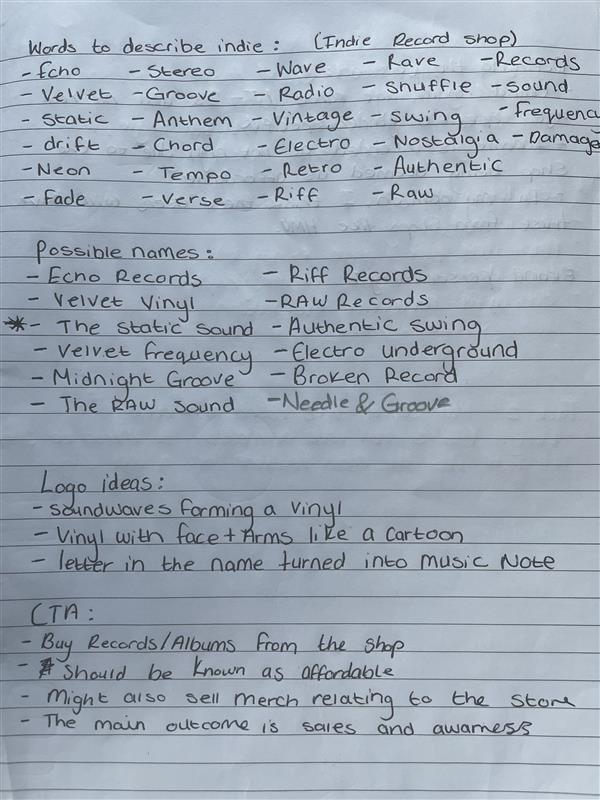
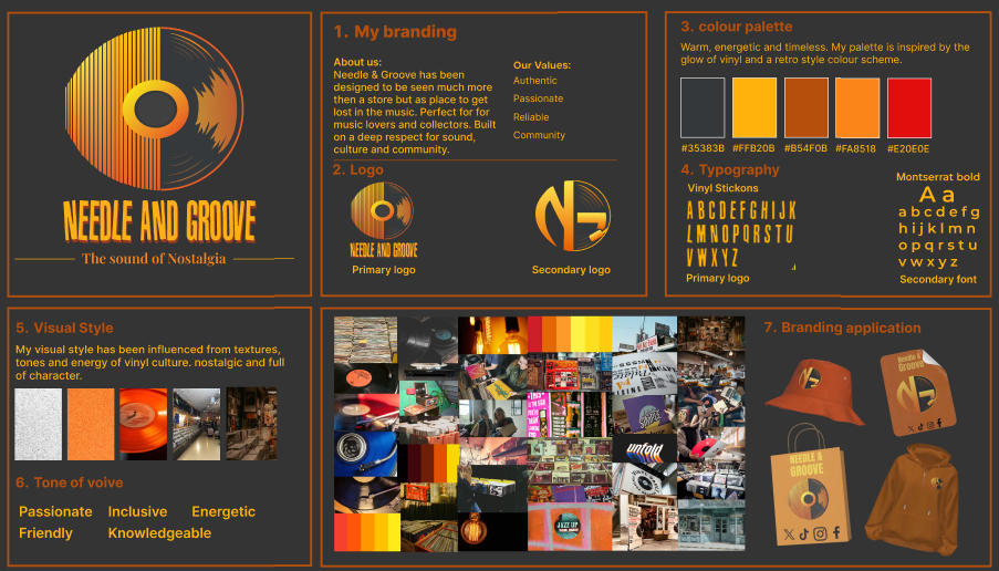
Throughout this project, I will be creating a professional and visually engaging brand pack for my fictional vinyl record store, which I named Needle & Groove, I landed on this name after creating a list of words which I believe are used when describing vinyl’s and the idea of classic and vintage, after listing words I started to put some together to try and make a connect and a name which is a give away to what the brand is all about, and in my opinion the name I chose helps to capture a vinyl record store aesthetic, however both words are also references to vinyl records too, as the needle refers to the stylus used on the record player and groove is a reference to the groove which is how the stylus can play the music when it traces it. The main concept behind this brand is to combine retro nostalgia with a modern design and feel, which means I can appeal to a wider audience whilst still attracting the main target audience. My target audience is centred on older customers who may have grown up with vinyl records, such as 25-35-year-olds, as well as younger audiences who are interested in the revival and retro aspects of vinyl records and collecting.
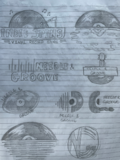
My logo has been sketched and developed to visually represent the brand’s overall message. It combines the right half of a vinyl record with sound waves, which are used to connect the full circle to the vinyl record. For my colour scheme for the logo, I used a warm retro-inspired colour palette which features black, light and dark oranges, bright yellows and a range of dark and light shades of red. The black is used to represent the classic look of the vinyl record, whilst the other colours are able to visually display this idea of warmth, vintage, and energy in the designs. For typography, I’ve selected a bold headline with vinyl-style characteristics, similar to what the band “Sex Pistols” uses for their logo. This choice of font is the perfect balance between clean and readable, whilst also providing the stylish and nostalgic feel I wanted to portray, but appearing professional to be able to be placed in both print and digital formats.
For my animated brand assets, my logo shows the vinyl in place on the right side, with the left side being made with animated sound waves in the orange and yellow colours, which I had previously mentioned. Above this, I have placed the name of my brand, which also has a slight movement to it, the Needle & groove text moves about with a slight jitter, just like how lyrics may appear within a music video.
For my animated typography, I used my brand and stacked it multiple times on top of each other to create a bold composition. This text was animated so that each section of text moves horizontally from left to right in opposite directions, creating a subtle rhythm, and visually looks like a 90s pop music video because of both font and colour scheme. Similarly to my logo development, the opposite direction movement was inspired by the idea of soundwaves and the flow of music from these waves, linking in again with the brand’s visual identity. Overall, the animated typography successfully transforms the static brand name into a fast motion asset and is something which could be used professionally, for example, for promotion or building brand recognition.
For the animated infographic, I created a timeline showing the evolution of music formats from vinyl records to modern streaming. This concept strongly links to the nostalgic identity of Needle & Groove while also showing the progression of music technology over time. I used position, scale and opacity keyframes to animate each format onto the screen in order.
To produce all my assets in Adobe After Effects, I used animation tools such as key framing, position changes, and the scale effect, to name a few, when creating all my transitions and animations. If I were to improve the project further, I would add sound effects to these, such as a vinyl crackle or a needle drop audio, to improve and build on this vinyl/music theme. Overall, I believe that my brand pack successfully creates a clear and recognisable identity which translates all my static assets into motion.
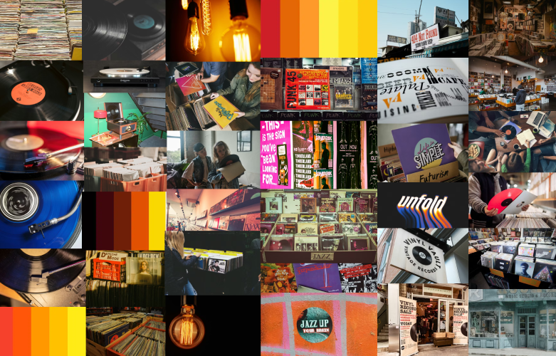
All images used in the infographic are from unsplash and my product mock ups were created using Pacdora.