For task 2, I developed a full-screen web animation which would be intended and included for a landing page of a vinyl record shop. I aimed to develop an eye-catching message and impression that immediately communicates the brand’s identity while also being engaging for the target audience. My animation features a vinyl record spinning into the screen and then spinning back around to transform into a CD. Curved around the vinyl record is animated text, where my brand name is presented to add both movement and personality. On either side of the vinyl player, I’ve placed surrounding music notes, which also jump around, as this helps with reducing space and reinforces the music wave idea even more.
The main concept behind the animation was to visually showcase the evolution of music formats over the past 60 years, a similar idea to what I produced for my infographic, with the timeline of evolving from using record players to then listening to music via CDs. By animating this transition, I was able to visually tell the story of how music technology has changed throughout the years, something which I think adds meaning to my animation rather than being a decorative asset.
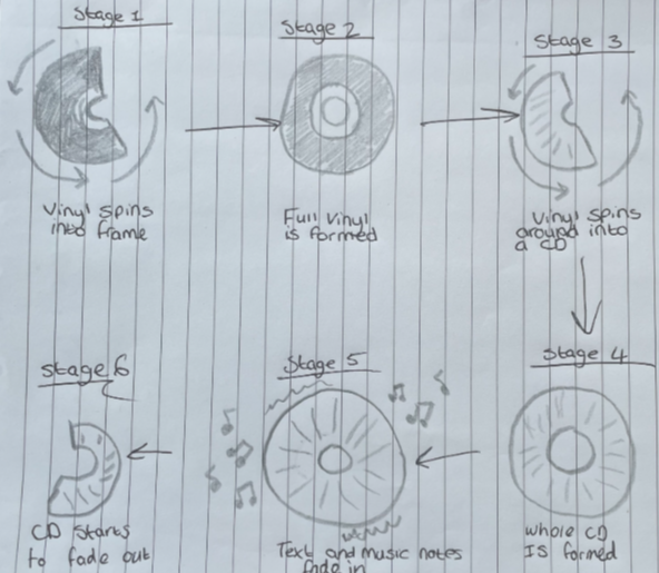
To plan my animation, I created quick sketches and a storyboard layout to visually see how certain areas will work for this, such as movement, composition, and the placement of the different elements. My original idea for this was to have multiple music formats moving across the screen, such as streaming and a radio, but I felt that this would be too cluttered and cause the whole animation to look messy and unprofessional. This may have also looked too busy for a homepage hero section. I then decided to simplify the design so that just the vinyl record becomes the main focus piece of the animation, choosing to animate the vinyl only as the vocal point of the design, which then made the whole thing look a lot more professional and something that audiences would expect to see for a vinyl store.
To add more energy and professionalism to the design, I included a couple of additional animated elements. Music notes jitter around the background, whilst the text alongside this also has the same jittering animation to it. This helped with filling in the black space around the vinyl record, whilst also helping to make the whole scene not feel as flat and uninviting. The text, which is curved around the vinyl, consists of the brand name and a simple call to action, being “shop in store now”. As this was designed for a website hero section, I thought it was important to refer the target audience to the store so that they can make a purchase.
The colour choice for this was important for displaying my brand’s identity even further than just the name. I used dark tones for the squared background, with the borders being coloured by a darker shade of red. Most other key aspects regarding the animation are also made up of darker colours, especially the vinyl, as I wanted this to be similar to the ordinary colours of a vinyl record. However, the reflection from the CD is where I was able to display my brand’s identity, as the CD rotates, the reflection is then shown, with the colours of the reflection being multiple shades of yellows, oranges and reds, which are 3 of the 4 main colours I have chosen for my brand’s identity.