Task 1: Art Direction campaign analysis
For my art direction analysis, I decided to pick the Jaguar “copy nothing” campaign which released in the November back in 2024. The campaign itself branches out from what the target audience are usually familiar with when it comes to the recognition with jaguar, the campaign steers away from the main focus of their cars and instead focuses on intense visuals and futuristic style promotion. With the name of the campaign being inspired by the words of the founder, William Lyons, “A Jaguar should be a copy of nothing”.
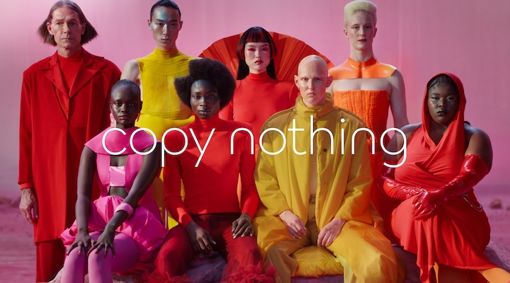
The art direction and visual strategy of the “copy nothing” campaign feels more suited towards a fashion brand advertisement or even an art piece due to the lighting and pop art style of clothing each of the models are wearing, a complete opposite to the classy and luxurious identity the target audience are used. Rather then displayed the new range of cars, the campaign focuses on neon colours, a pink set and bold word choices, yet this direction for the campaign created a sense of originality and a out of the ordinary reaction, which perfectly sums up the identity that jaguar has, reflecting the idea of “copy nothing”. Suggesting that owning a jaguar is more about the taste and identity, rather than just a car. The overall tone of voice with this is somewhat mysterious but also confident. In my opinion the decision to not over explain and advertise the product shows how premium the brand is, suggesting that it doesn’t need to convince users or explain what the brand is, which helps to highlight the confidence regarding their products. The typography used in the different shots is kept too a clean minimum aspect and placed in a way which doesn’t cause a distraction and allows the visuals to do most of the work and explanation. Similar to how big brands such as Apple advertise, focusing on lighting and simplicity rather than overwhelming the viewer with information. This creates a sense of confidence, as if the brand doesn’t need to prove itself.
Choosing this direction to take the campaign was smart design decision, as jaguar knew the campaign would gain mass attention and be a conversation starter. Instead of following the typical car advertisements which focus on the speed or performance, the idea to take a conceptual approach immediately makes this advertisement stand out compared to any other car brands, yet again reinforcing this idea of originality, linking back to the campaigns message of “copy nothing”. However this approach also creates challenges regarding the effectiveness and the communication across to both the new target audience and the existing audience. Whilst the campaign performs strong visually, its not clearly communication what Jaguar are actually offering, the lack of focus regarding the car means that the users don’t receive or understand any important details about the latest model such as performance and features, therefore being unclear to a majority of the users and providing no real selling point. Jaguar is historically associated with luxury and overall performance, however by moving towards an abstract and more fashion style of advertisement, the campaign risks disconnecting and moving away from their original history and association. Whilst this new style may of attracted a new audiences from a range of age groups, it could potentially cause the original and traditional target audience to feel less relevant with the brand and turn away from anything Jaguar does in the future.
The campaign priorities a visual style over clear communication, limiting the reach and understandability this advertisement may have. The main change I would make if I was the art director to reach broader audiences would be to keep the flashy visuals but also be providing detailed information and statistics about the cars, this strategy would then help audiences who are less familiar with the brand to understand what is being offered without losing the overall aesthetic.
Task 2: Responsibilities of an Art Director within contemporary graphic design practice.
Task 2 explores the roles and responsibilities of an art director within contemporary design, focusing on how visual decisions help to communicate and influence a message across to the audience. The creative director is responsible for developing the look and feel of a project, making decisions about imagery, typography, layout and the overall visual tone, whilst also making decisions regarding partnerships and investments within the brand. The senior designers are responsible for turning the creatives ideas into a final product and form, having a strong understanding of all things relating to the visual styling allows them to produce the high quality work that’s required. Alongside designing, the senior designers also manager different areas of the project such as making sure deadlines are met and maintaining high level standards and consistent throughout. The role of the account director is to manage both the advertisement and marketing throughout a campaign, one of their main roles is building and maintaining a strong relationship with all the clients, focusing on the clients needs and the work produced meets all the possible needs. The account director is the main link and source of communication between the client and the design agency, making sure he project stays on track and the client is happy throughout the entire process. As well as manging the clients, the account director contributes to the growth of the agency by identifying new opportunities and building more connections with potential clients.
The art director I have decided to focus on was the work done by Peter Saville, an English graphic designer and art director known for developing iconic album covers for a list of popular bands. Whilst working for the British label company Factory Records, Peter designed a handful of album covers for the likes of Joy Division, New Order and Pulp, with most of his work being designed for New Order, challenging the idea of the simple and traditional styles of covers.

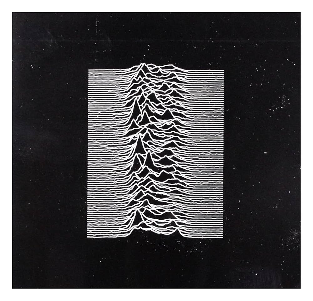
The best example of this was his design for the Joy Division album Unknown Pleasures, which features a black background with white radio sound waves making up the rest of the image. The reason this challenged the traditional style of album covers was that across this design, there is no brand name or title placed anywhere, which was deemed both confusing and unusual at the time of release in 1979. With no visual branding present, the audience was then forced to engage with the design. Peter himself claimed that this made the album “mysterious”. This reflects a clear art direction choice by Peter to prioritise concept and mood over direct communication.
The impact of Saville’s work has been significant as he helped to redefine how music and branding could be presented, moving away from the basic imagery and instead taking a more conceptual approach. Peter’s influence can still be seen in contemporary design, especially in fashion and luxury branding, where less communication within a campaign or advertisement often symbolises exclusivity, similar to Jaguar’s “copy nothing” campaign I talked about in task 1. By removing the need for branding, Saville was able to turn graphic design into something more cultural and effective, something which bands then started to use when producing new album covers. One example of this is Blur’s 1994 album “Park Life”, which features two greyhounds racing side by side.
Branding and advertising campaigns have the ability to create impact and perception on a product or service, potentially influencing the value a product may have due to audience perception. Through art direction, a brand can make its product seem much more premium and exclusive because of how it presents itself visually within its campaigns. However, this can also work oppositely, if a brand applies too much branding within their advertisement campaign, it begins to appear too flashy and somewhat distracting, possibly causing the audience to develop the feeling that the campaign is trying too hard to advertise the product or service, because of this type of advertising the audience may potentially conclude that the product isn’t worth their attention and money due to the desperate nature a campaign may have, linking back to that confident campaigns shouldn’t need to persuade the customer, the customer should already be convinced.
Task 3: Developing ideas and concepts in Art Direction practice
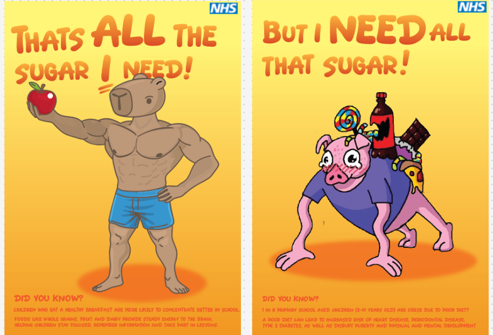
Task 3 reflects on all the methods used within the workshops to develop ideas for our collaborative campaign work, focusing on each stage from concept work to developing the outcome. The campaign itself focused on the NHS and their urge to promote healthy eating and the 5 a day. These methods helped me to come to the conclusion on what designs may work well and be understood by the set target audience.
Once the target audience had been defined, the first stage was about mapping out the route to take to share key information in the best possible format. Mind mapping all my ideas was an important start to beginning the project. As our target audience for the campaign was centred around children between the ages of 5 and 12 years old, once the direction had been decided, it then made the process easier due to being able to experiment with the visuals and the layouts. With the target audience being young children, it was important to tailor the campaign to something they may relate to or have an interest in, which led the campaign to feature two cartoon style character with the idea being that this would then catch the eye of the age demographic, similarly to how a movie or video game would do with its characters. Taking a direction which was simple and text-heavy was an early start point as this would be useful to share key information for the target age groups helping to inform them about the negatives regarding a poor diet, however after mapping out a possible visual it was clear that this was the wrong direction to be heading in as there was no stand out factor with the design and something children wont relate too and engage with, leading the campaign to be a failure.
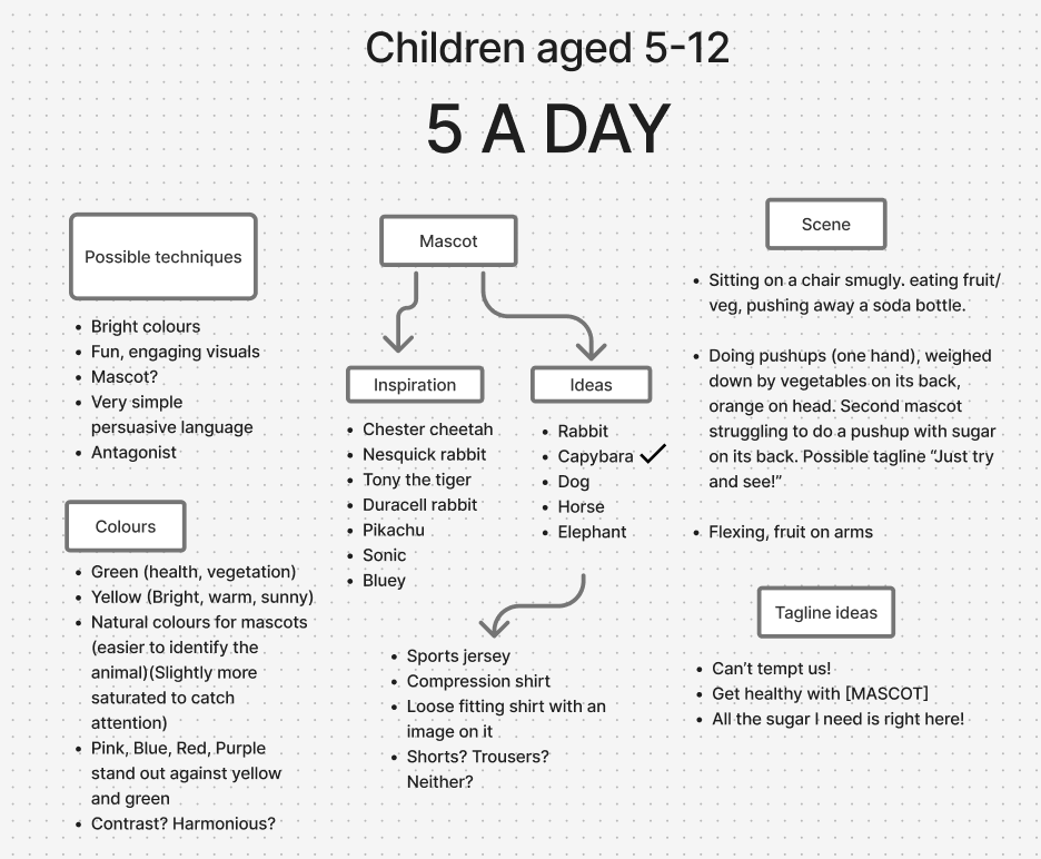
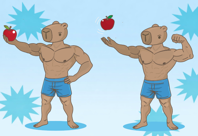
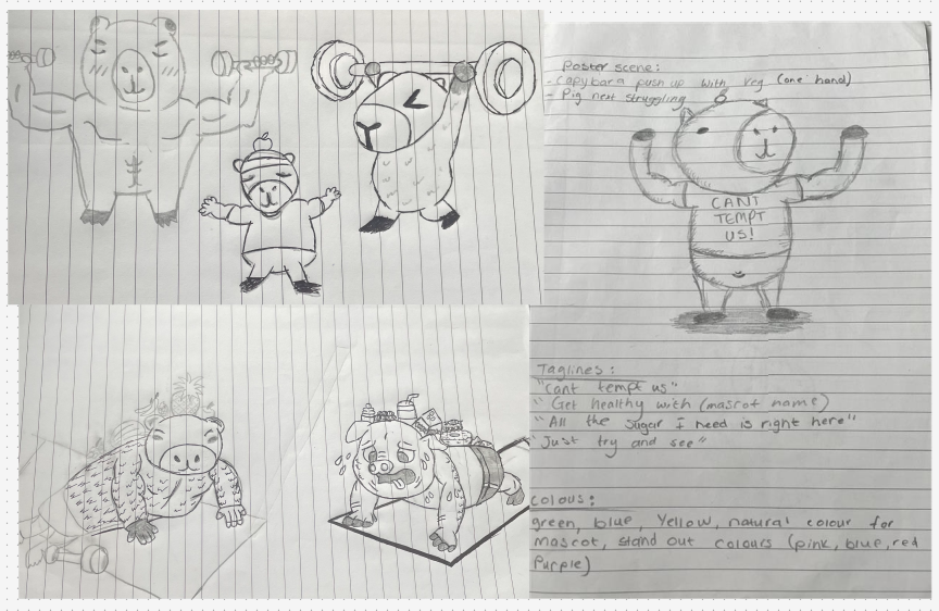
Once the direction of the campaign was decided, my partner and I then discussed what approach to take with the campaign and who would be in charge of each design element. My role in this project was to design the healthy lifestyle character for the campaign, something that children can feel attached to and engage with when seeing the posters. The campaign was then split into two different posters rather than one big design. The reasoning behind this was that we believed both characters, alongside key information regarding different lifestyles, were too visually overwhelming and somewhat distracting. Designing single posters allowed for key visuals to be mapped out much more effectively, with a relating fact at the bottom of each design. My role in this was about designing the capybara character, the character which is seen as the healthy alternative between the two. Concept development, quick sketches and visual prototyping then allowed me to understand what would be eye-catching for children. Creating design drafts allowed for experimentation with the outcome, helping to refine all areas. This process was important for identifying what worked and what needed to be improved, leading to more considered design decisions.
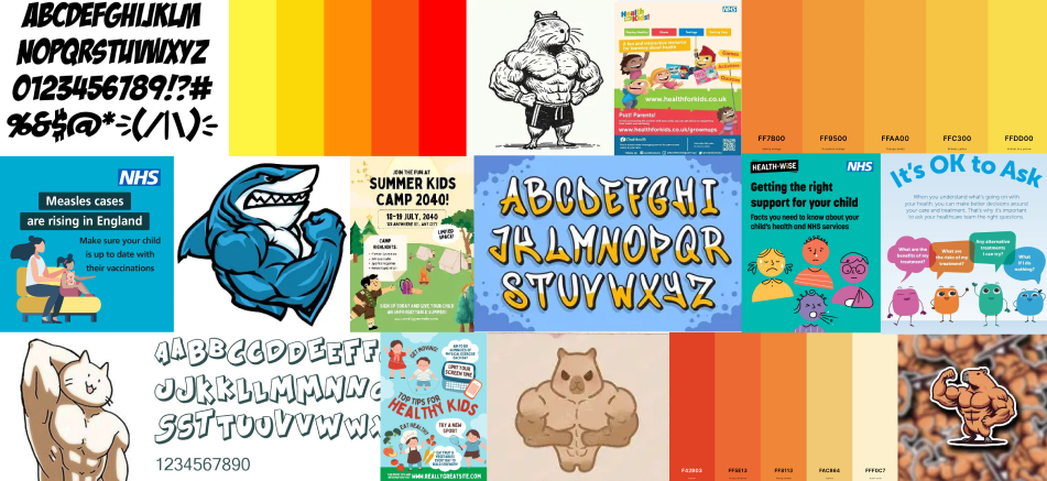
Mood boarding was another key method I used across this campaign, particularly to outline the overall tone and visuals. By mapping out ideas for the colour schemes, typography, imagery and layout, it became easier to develop the consistent style I was aiming for. With this being an informative campaign, it was important to design something that children could potentially learn something from and make tweaks to benefit their lifestyle, an example that simple visual decisions may have a strong overall impact. This process was important for narrowing down ideas and avoiding inconsistency later in the project, whilst also being used as a constant reminder about key design aspects, such as chosen colour schemes and typefaces that worked well for this project.
Overall, the methods I’ve used supported and benefited me during the development stages by allowing my ideas to develop through both experimental and planning stages. These methods also helped to build a clear structure for the project and were important when trying to maintain consistency across each different stage. When reflecting on the collaborative process, mood boarding and prototyping were especially effective when trying to maintain a strong visual identity, helping to move the project forward and reach the outcome. For future projects, more time should be spent on creating initial concepts before moving straight into the digital design, as this would then allow for more exploration and developing more unique posters. The different design stages I’ve used highlighted the importance of planning and experimenting in art direction, showcasing that strong visual decisions help create an informative and impactful outcome.