The three advertisement banner ad designers were created to help promote my brand on a further level, in the hope of creating brand awareness and reaching the correct target audiences. All three banner designs were designed with both the target audience in mind and the earlier user personas that I had created. Across all three banner designs I focused on keeping a consistent style choice as this will allow for a cohesive campaign overall. With all the chosen imagery being free use when using adobe express. All of my banners had similar themes which was about promoting the idea of recycled materials transformed into clothing and equipment.
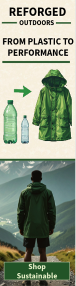
The first banner that I designed was the 160x600px wide skyscraper banner, as this is the most vertical banner out of the three, it was hard to fit a lot of imagery in that would represent the brand well and display the brands identity, however this allowed for more visual story telling then imagery. In my opinion the vertical layout guides the user through the ad perfectly, by starting from the top where the logo has been placed then down towards the main message and caption of the banner which briefly mentions turning the plastic waste in products, then finishing of with the bottom of the ad design which is the CTA which displays text about shopping with the brand. Overall, this is a positive design as its quick and simple for the users to scan through it all and instantly understand everything they need to know regarding who the brand are and what they do.
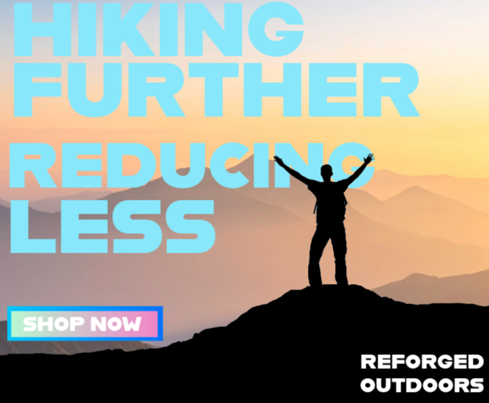
The next banner design that I created for my ad campaign was the 300x250px rectangle banner. The size increase of this banner allowed for more content to be displayed and more of a brand image to be portrayed, the layout on this banner allows for an even split between the imagery and the text, with the imagery being the main outstanding factor, although not too distracting to ensure it doesn’t take away from the message and the users can still understand what makes my brand different from the rest, the key information such as the brand name and sustainability factor is still clear and bold. The strong headline combined with the CTA allows for the users to quickly understand the purpose of the advertisement early on.
The last advertisement piece I created for the campaign was the 300x50px mobile banner ad, this one was the hardest one to design in my opinion due to the limited height space of the layout. As this is a mobile banner I wanted to keep for this one as simple as possible because most mobile users swill swipe straight past majority ads, so I knew I had to design something quick and effective, enough elements for the users to understand my branding in limited time. That’s why the name, branding and message is the first area the users will look towards. Despite the size of the banner and the lack of visual elements this still helps to communicate all important details.