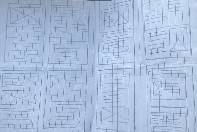
The first stage of developing my wireframe prototype was creating set of quick sketches then get an understanding on the chosen direction. To provide me with a starting point I created 8 simple wireframe layouts, each having 1 minutes worth and drawing a different layout to the last. Once I had my 8 sketches I chose the one I thought worked the best and then turned that into another quick sketch, readying it for the mid fidelity wireframe layout.
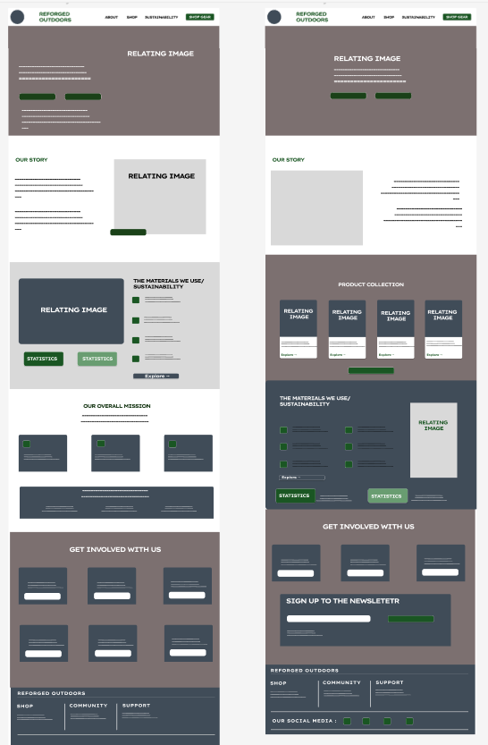
I developed two of my earlier sketches into mid fidelity layouts as this was useful for showing the direction of the wireframe, the first design I was focusing on simple but bold visuals, the wireframe has boxes which are used to display images and text blocks. Whilst the second wireframe I had designed focused on navigation and the users experience. Creating these two wireframe prototypes were helpful as it allowed me to visually see the UI and UX strengths and weaknesses between the layouts before I then created the high fidelity layout. With the high fidelity layout then combining the positives from each layout design.
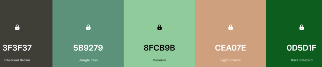
Now that I had mapped out the overall layout for the high fidelity layout, I needed to decide all the key aspects for the UI side of the layout, such as the colour palette and the typography choices, I focused on the consistency and and simplicity when finalising the prototype. My colour palette was chosen to reflect the brands overall identity but to still fit in with a professional manner allowing the site to be accessible and readable. Which is why the greens featured are mainly darker colours, with lights greens and whites being used for text blocks and buttons. The typography was kept both clean and modern, but the users will see the clear difference between the bold headings and the body text, helping to establish a visual hierarchy overall. The alignment and spacing between all the text is important as this helps to reduce any confusion the users may have when reading the text and navigating throughout my webpage.
The UX side of the website was designed to ensure that the users are able to easily navigate through the page and interact with a specific part of the home page, the navigation throughout the home page is simple and labelled, reducing the chances of confusion when scrolling through. The placement of each element on the home page allows for a smooth transition and positive user flow, with the linking information being available as they transition through, yet again reducing the chances of the user being confused on where to scroll to next. All the buttons are clearly marked throughout and correctly labelled and placed, each with a white or green stroke which helps to identify them for users who may have sight difficulties. To display the input to the users regarding buttons, when hovering over each individual button it transitions into a darker shade of the original colour, showcasing that their input is working.
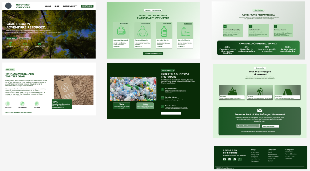
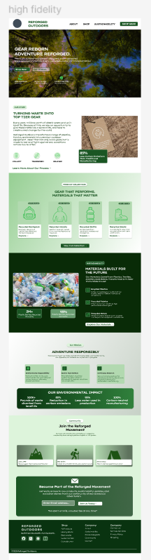
The specific target audience for my website and the brand as a whole is hikers and outdoors explorers who are environmentally conscious yet who still value quality, the represented age of my target audience is young adults onwards. In my opinion the design helps to represent this target audience as it features a clean and natural visual design throughout. All supporting product information is labelled and displayed accordingly to ensure its clear, which allows the users to easily understand the environmental benefits that the gear has and the change they are helping to create. The website mainly appeals directly to the users who are motivated and interested in both practicality and environmental impact.
My overall design supports business goals by displaying the information clearly and encouraging user to engage with the home page layout. The style and flow are tailored towards the target audience, which makes sure that the site is approachable and easy to trust, trust is a big factor with my business as the users will need and require proof that their purchase really does help towards creating an environmental change. When reflecting on the overall process, developing ideas through sketches and early on layouts helped on influencing the final design and improved both usability and effectiveness.