The starting point for my logo development consisted of researching similar logos of real company’s that featured similar symbols and icons I aimed on including in mine, most of my research was done using Pinterest and dribble. Most of the logos I had research consisted of the same mountain, trees and life combination yet managed to still look clean and official, this gave me ideas on how the placement works and how it works well in these types of logos. Instead of copying the logos which I liked, I used these as references to mould and form ideas for when it came to designing my three logos.
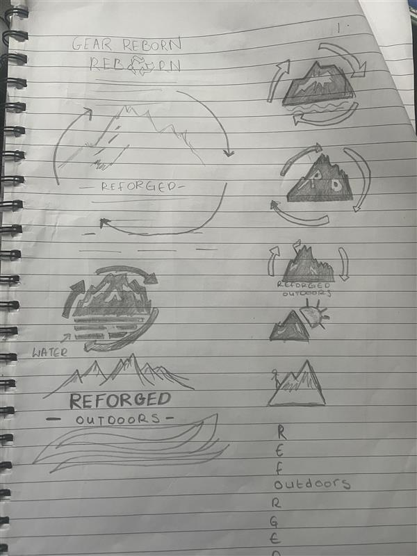
The ideas I had thought of from using reference images, I sketched out some early mock-ups to see a visual representation on which ideas worked and which ones didn’t, this also meant I was able to try out a range of different shapes, placements and symbols. All the sketches included most of the same elements, which were mountains recycling symbols and waves, this process then helped me to understand the strongest set of logos and the most suitable for company branding. The sketches that I thought were the best, I started to create mock ups using adobe illustrator.
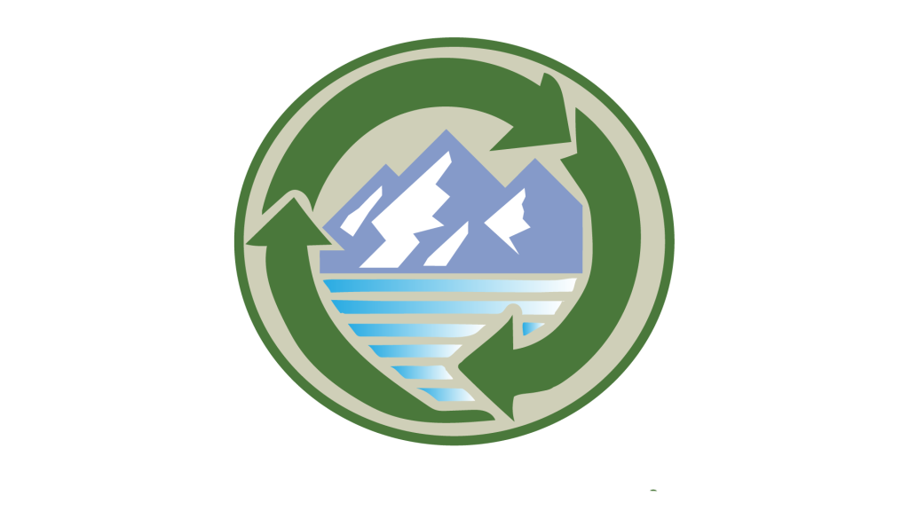
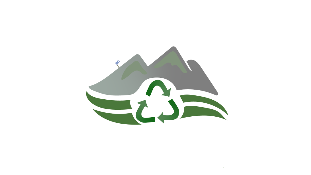
The three logos were developed to ensure that I could successfully communicate across the idea about sustainability regarding the products as this is main selling point of the brand. The first logo variant consists of a mountain and a river with the recycling arrows wrapping around to circle it all in together. The logo cleverly communicates the branding message across from a first glance and is well suited for a smaller size usage, such as product labelling or on social media posts. The logo design would also be suited across a range of users platforms. However the only issue that I had with this design was finding room to fit in the company name, meaning this would be used as a secondary logo in multiple different ways.
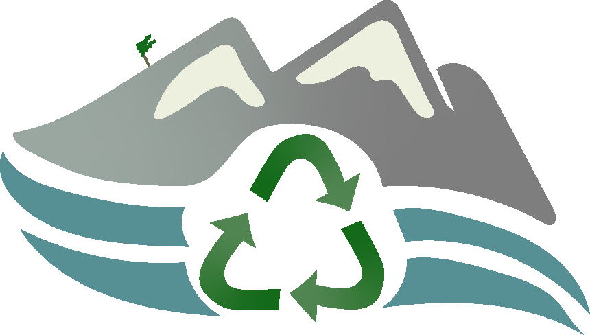
The second logo I designed was an adaptation of the first one but including more rough edges to try and get that unnatural mountain feel, featuring all the same elements however this time including the company name in the centre of the design allowing the naming to be the prime vocal point of the logo. In my opinion, this design is the best suited for being the primary logo and face of the company as I put more focus into brand recognition and branding identity. The logo helps to showcase both the ethical and functional aspects of the brand appealing to those who value quality and environmental benefits.
Exported Minimum 150 pixels, 72 dpi and RGB colour mode
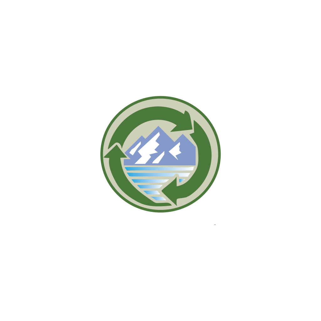
My last logo design is something which is such a simple design with not intense detail, yet something that I believe may work well in a range of environments such as social media marketing or product design. Although this design doesn’t have as much depth compared to the other two, I think it’s something which can be deemed as recognisable and instantly understandable to what the branding is all about.
Exported Minimum 150 pixels, 72 dpi and RGB colour mode
The technical aspect was also a big consideration I had to be careful of when designing the three logos as they had to work effectively in both digital and physical scenarios. The logos have been developed as vectors images which meant that I can scale all three up without reducing the overall quality and appearance, making them adaptable for a range of usage.
As an overall reflection on the logo development process, I think I was able to successfully showcase the brands core values and ultimate mission. The stages of research, sketching and developing these selected few designs is what helped towards reaching the professional outcome, with each logo variant displaying the brand identity in different ways, yet again helping with the flexibility and usage side of the designs.
References
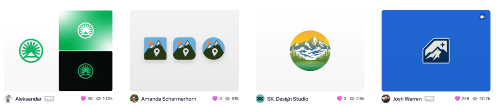
Dribble liked images:
Letter A + Sun logo mark by Aleksandar on Dribbble
PeakBagger App: DailyUI Day 5 by Amanda Schermerhorn on Dribbble
Outdoor/ adventure/ mountain & river logo design by SK_Design Studio on Dribbble
Altitude by Josh Warren on Dribbble
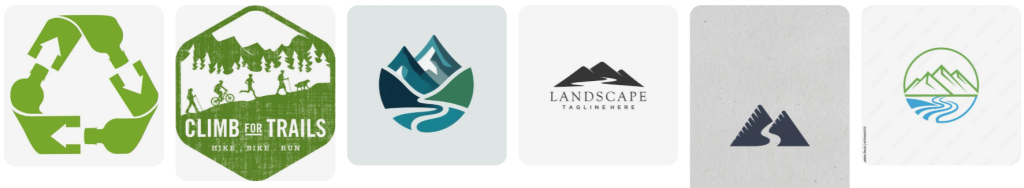
Pinterest board images: