Introduction
The Participatory Collective was created to allow both physical and virtual communities across Hull to come together and offer a platform for collaboration, creativity, and overall change. The collective exists due to a growing need for more accessible and welcoming communities, in which lesser known groups can be acknowledged and supported. The Collectives aim is to centre these communities that may not be receiving attention, funding and the required resources. The participatory collective offers these communities a range of opportunities such as, future projects and involvement, meeting others to share personal stories/ struggles and helping to highlight the challenges faced by these groups. The purpose of the collective is not only to make these voices of the community heard, but also to help create a future full of support and funding and increasing the popularity of each of these supportive groups. The collective aims to help communities influence change and contributions.
The work of the Participatory Collective matters because without them, many communities are at risk of being excluded and supported leaving possible members without a community to turn to for support. The Collectives purpose is to provide that space in which individuals needing support can find members who have experience certain problems and sense of belonging. The Participatory Collective believe that to make a change, it must come from these different communities due to the experiences of members. Members of these communities are the ones who have lived through specific challenges, therefore hold invaluable insight and understanding on the support needed to overcome difficult situations, helping towards making a change in peoples lives. One of the main focuses of the Collective is the human connection, building trust, relationships and respect are seen as a major step in helping these communities grow stronger as a whole. These values are important to the collective as these are the key emotions and actions which will help to create positive change in the future.
In my opinion, the major challenge faced by the Participatory Collective is the amount of funding which they are getting. Local governments often overlook these groups, this may be due to the amount of members each community has or the size of their physical and online presence. But despite the lack of funding and acknowledgement, the groups supported by the Collective continue to make a a difference within its members life, helping to create lasting relationships between the members, allowing people struggling to feel both valued and supported. The Collective shows that a positive change doesn’t have to be based on the resources or the community size, and that actually, the people and relationships made are the driving factor. By bringing members each with their own experiences together, it creates human connection. Overall, the work of the Participatory Collective shows that when communities are given the support, recognition and funding, they can create a lasting change within someone’s life.
Research on community groups
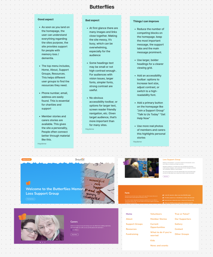
The first community group I researched that are partnered with the Participatory Collective was Butterflies, an organisation that supports people affected by dementia, which included those living with the condition, carers, and individuals who may be showing early signs of dementia. The website’s homepage is designed for easy navigation which is beneficial for users who may experience confusion. The butterflies webpage layout helps to makes it easier for visitors to find resources and extra support they may require. The web page layout helps to create an inclusive and welcoming environment across the site. One feature which I thought was important to include was the members Stories section, this adds a personality to the site and creates an early on connection between the community and the users. The overall design of the site is simple and consistent, using a mainly white background with light accent colours, with the addition of occasional images. However, one area on the butterflies site that I think needs improvement, is the amount of content displayed on the homepage. At first glance it feels slightly overwhelming, which could be challenging for users, especially those with dementia when navigating. Simplifying the content and breaking it into smaller sections could help improve the user experience and overall accessibility.
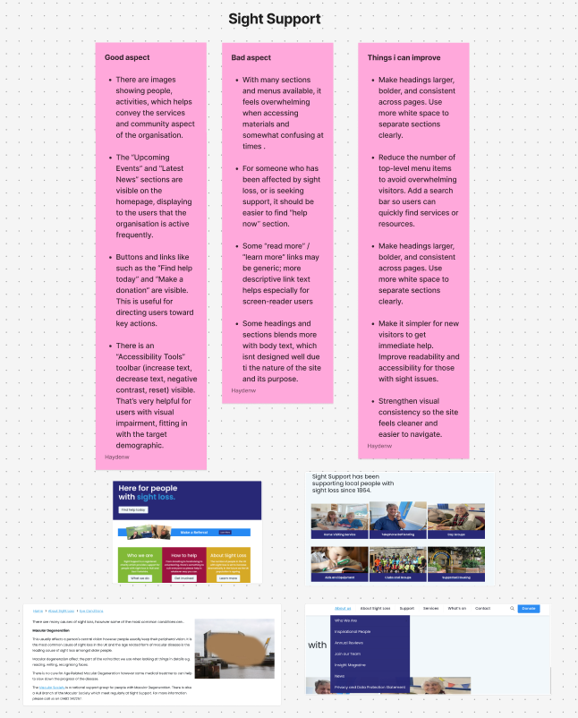
The second community group I researched was Sight Support, sight support that offers assistance and support to individuals which are experiencing sight loss or early signs of visual impairment. One of the strongest aspects of the Sight Support website is the attention to detail and the overall priority of accessibility. The accessibility toolbar allows users to adjust the text and image sizes, the website also allows the user to choose from a range of colour schemes and options. These features are especially valuable for the sight support target audience, supporting those with visual difficulties, allowing them to easily navigate and access the content. Another positive and strength of the website is the “upcoming Events page”, this section shows that the organisation is active but also provides the community aspect community by encouraging new and returning members to connect with others also dealing with visual impairments. Offering both inclusivity and the community aspect, two important values to the participatory collective. Regarding the design, the site follows a simple approach, by using a white background with darker colours used for borders and dividers. The design may appear as plain, but I believe that the simplicity is appropriate and needed, given the audience’s needs, helping to avoid visual strain. However, one possible improvement that could be done, is the addition of a faster navigation feature, such as a search bar included into the accessibility toolbar. This would make finding specific material more efficient, enhancing the overall user experience.
Design Inspirations
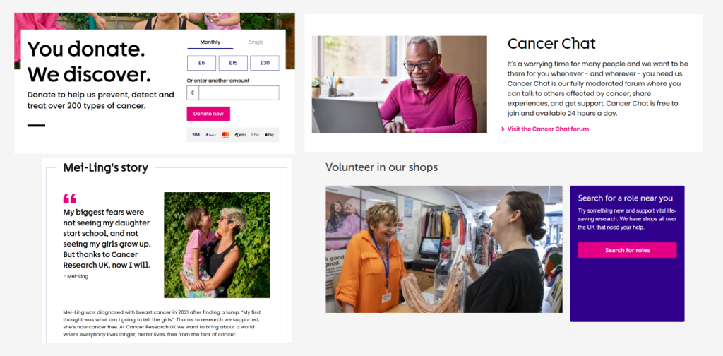
The first non profit campaign website I researched for design inspiration and layout ideas was Cancer Research UK, a charity dedicated to supporting those affected by cancer. My review focused on both the design choices and accessibility of the site. The brand maintains a consistent and recognisable visual identity throughout, using a range of pinks, purples, and blues with the rest of the site being filled by white space which I liked and worked well across the website. The use of these colours creates a clean, professional, and welcoming impression, linking in with the charity’s mission of care and support. The consistent use of these colours creates brand recognition but also helps to create a sense of trustworthiness, which is one of the most important qualities for a charity. The pink tones also has connections to Breast Cancer UK, reinforcing the visual identity and recognition. Most of the imagery features volunteers, researchers, and people impacted by cancer, this helps to add a sense of authenticity and connection to the site. Focusing on the community side and to highlight all the important work the charity has done. Another strong design feature is the calls to action throughout the site. Buttons encouraging users to “donate” “get involved” and “learn more” are always visible, providing opportunities for engagement at all times. This helps to keep the audience connected whilst also guiding them towards being involved in everything the charity does. Overall, the Cancer Research website showcases how a strong visuals and clear communication can result in a site that is both engaging and effective.
The second non-profit organisation I chose to research was the British Heart Foundation. The organisation focuses on offering treatment, research and funding, whilst also providing emotional support for those who may need it. When reviewing the website, the homepage immediately stands out due to the informative layout and design something which can inspire me. The call to action buttons are bold, visible, and strategically placed to encourage user to interact as soon as they open the website. The design scheme consists of a strong brand consistency and identity, using a red and white colour scheme that links in with the organisation’s logo, it helps to displays the care and trust within the charity. The use of white space is effective as this allows the uses attention to always be focusing on the key elements such as imagery, text and calls to action. This creates a clean and accessible layout which helps to communicates the British Heart Foundations message whilst guiding users towards engagement.
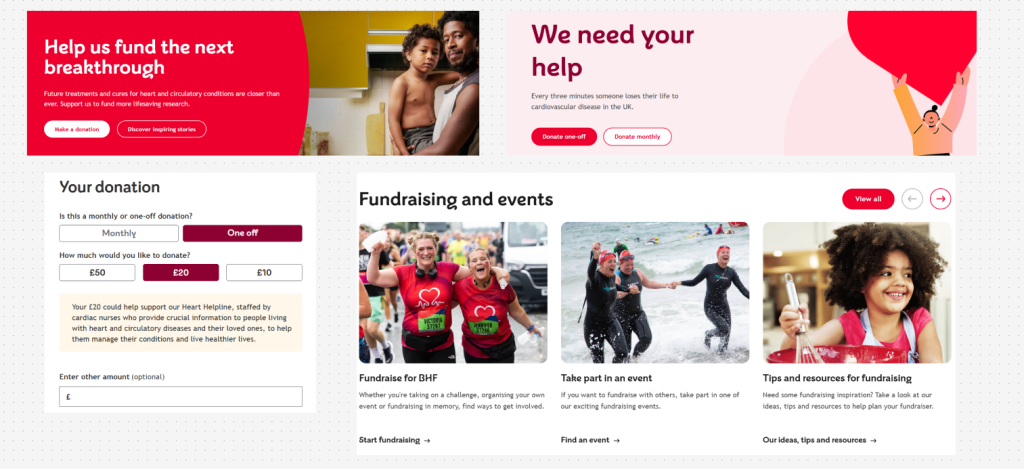
Screenshots from the British heart foundation website
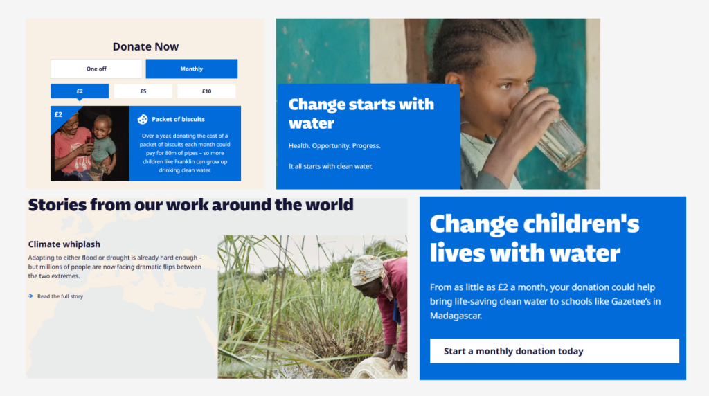
The final organisation I reviewed for design inspiration was WaterAid, the focus on human needs is reflected throughout the charity’s website design and visual branding. The overall design and layout across the website is clean and simple, which helps to remind the users of the charities mission, reenforcing the ideas of purity, health, and a clean hygiene. The colour scheme consists of white and different shades of blue, which displays the association with water and cleanliness. These colours have been used strategically to guide the user’s attention and to remind the user about the water aid brand identity. Darker shades of blue are used for the for call-to-action buttons. Helping them to stand out clearly without appearing to distracting. The choice of colour scheme makes sure that navigation remains easy and accessible, whilst still encouraging users to engage with the site’s content. The images on the site act as a key role and message in communicating WaterAid’s importance. The images used across the website include people in the local communities gaining access to clean water and participating in other health related projects. These images add a sense of authenticity, and a reminder to the user about impact of their support. The images showcase the work and improvements that water aid have achieved, whilst still reminding the user about the charities mission. The water aid design choices are a great example on showing that good design choices helps to effectively communicate the. key ideas and values
Early Experiments
The starting point for my logo design began with a list of key ideas and symbols that I believe represent the participatory collective and their key values. I had the idea of an umbrella in mind and began making simple sketches that combined the ideas I had noted down. When doing these sketches, I tried different styles before finalising a design which effectively communicates all the important ideas of the collective.
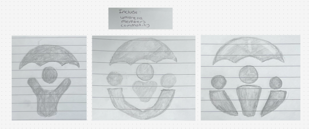
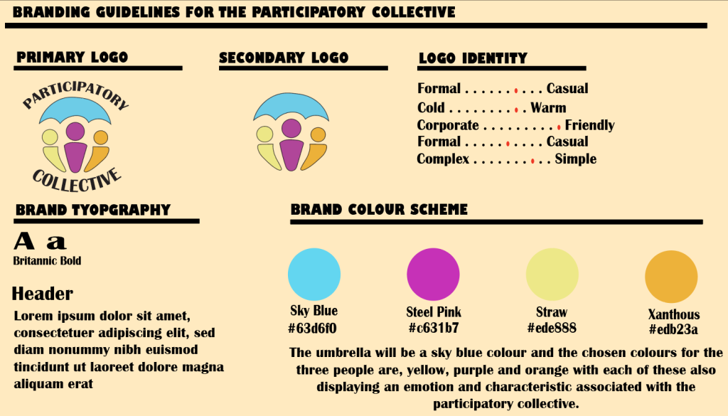
When designing the logo for The Participatory Collective, it was important that I included the organisation’s key values , such as what they do, what they stand for and how they help to connect people within the community. My starting point was to focus on the theme of togetherness, as the community is one of the main ideas regarding the collective. The final design features three people standing closely together under an umbrella, which visually represents support and unity within the community. The umbrella is an important factor within the design, this is because it helps to symbolises the ideas of safety, care and support, which would be gained when using an umbrella in the rain. In my opinion, it shows the strength that members gain from being part of the organisation. The three people which are under the umbrella, display the idea of inclusivity and shared experience. Visually showing how the Collective is a space which all members are supported. The simplicity of the design makes the collective seem as approachable and overall welcoming. allowing the logo to easily be recognised and used within websites, social media posts and poster, while still keeping the welcoming and community focused identity.
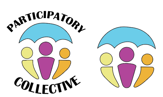
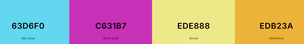
Each of the colours chosen within my logo have their own meaning and displayed emotion relating to the participatory collective, I’ve used a light shade of blue on the umbrella to represent the trust and calmness, representing the protectiveness and welcoming aspect of the collective. The chosen colours for the three people are, yellow, purple and orange with each of these also displaying an emotion and characteristic associated with the participatory collective. When doing my research, I found out that purple is an annotation for both creativity and respect, displaying the importance of creative collaboration within the collective and the overall respect shared between its members. Yellow is the colour used to show optimism, joy and positivity it shines light into both the logo and representing the participatory collective, a sign that members should feel happy and optimistic about the future and making a positive change. The final colour to finish the logo is orange, orange was chosen as this colour represents both warmth and welcoming, the collective aims to be welcoming to all members as this is one of the stages in gaining that trust between communities and collectives. All these colours had been carefully chosen for these reasons and not just due to the logo looking visually pleasing.
When deciding on the fonts to be used not only in the logo but also across the website, my aim was to find styles which were both visually appealing and accessible for all users and devices. I focused on only one font choice as this helps for consistency, and is important for maintaining the brand identity. I wanted something that complemented the friendly and welcoming tone already visible through the logo. I researched fonts that was visually welcoming, this included rounded edges and a bold style. Reflecting the participatory collective and their key values, such as inclusivity and collaboration. After researching different options, I chose Britannic Bold as the primary font, because it offers a good balance between professionalism and friendliness. The font’s simplicity helps to make it easy to read for any user and on any device screen, helping to improve the accessibility.
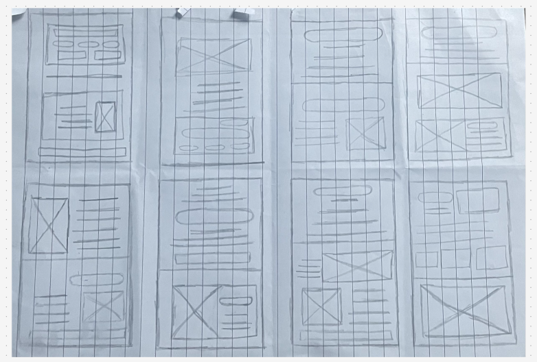
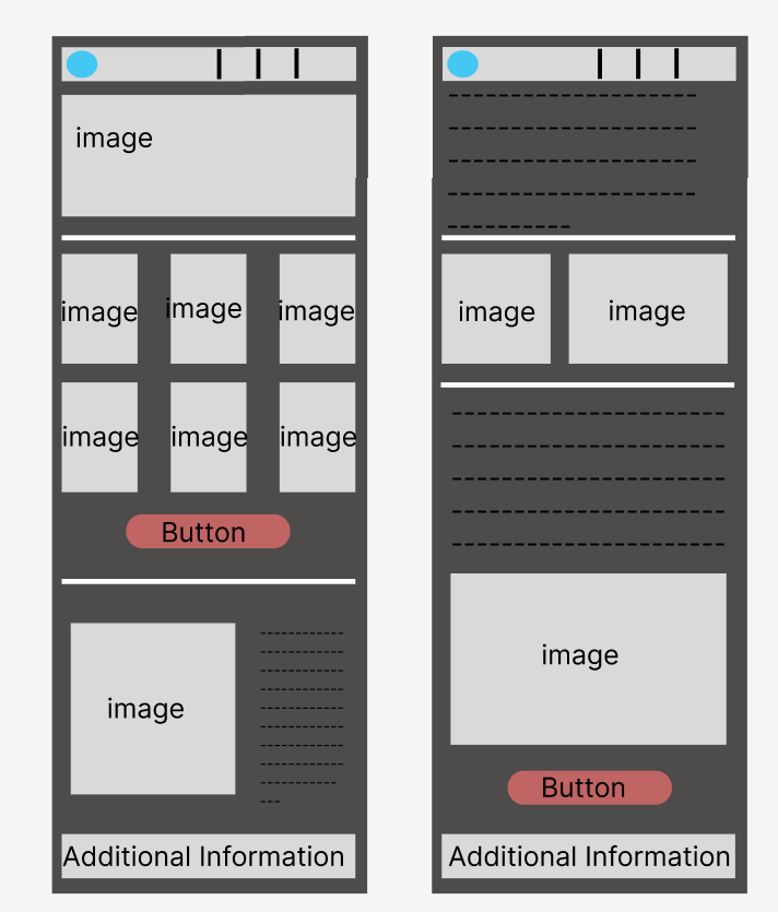
For making a layout, I developed eight different layout styles on paper, with each being drawn under one minute. All eight of these layouts consist of the same items such as buttons, text and images just in a variety of different formats, which can then give me an early start on making my layout using figma. With one bigger and more detailed sketch also being created.
Ethical and Inclusive Design
My design will be used to share the many voices of the participatory collective due to the different elements and colours chosen to make up the logo, the main aspect of the logo is the umbrella. The umbrella helps with the story telling of the design as it represents the protection and inclusion gained from being part of the collective, the three people icons used are important as they show the ethical and diverse side of the design. This was one of the main aspects visually I aimed at included when designing my logo, to represent inclusion the character icons featured in the logo have different colours (orange, yellow and purple) showcasing that the collective doesn’t discriminate about age, race or gender, providing the family like impression.
The design is accessible due to the colour scheme selected, whilst the chosen colours are on the lighter side, this is still visually accessible and pleasing for viewing, even if members do have sight issues, as I have catered to all possible disabilities when designing. This is the same with the typography featured in the logo, the text is big and bold wrapped around the logo but still clear and visible to the user. I included a good amount of spacing between the characters and the two words, just to further the viewing experience and visibility of the wording which also helps with reducing clutter.
The design can be considered environmentally sustainable due to the overall simplicity surrounding my logo design, which reduces the energy usage when downloading my logo on a webpage. Similarly to this, the logo doesn’t have any animations hidden within which also reduces the energy usage helping towards being sustainable. Besides the logo, the font choice had to be considered when thinking about sustainability, choosing a web safe font removes the chances of users being required to start a heavy download just before they can accesses all the material on the web page. The final factor which I can implement to the design of the webpage across the layout, is the option of light and dark mode. Having the ability to switch to a darker mode isn’t just for visual usage, but this also helps reduce the amount of screen energy usage.
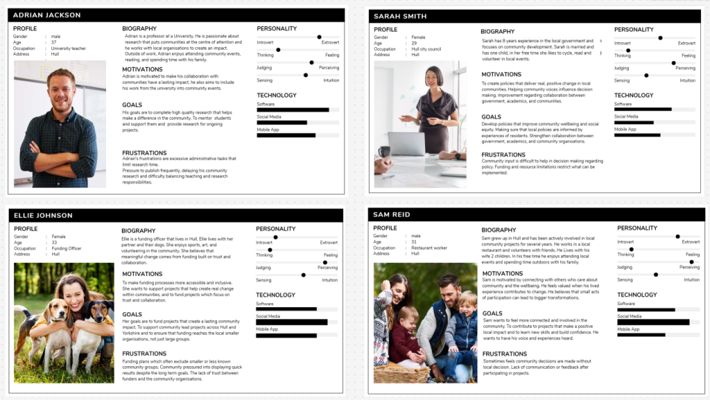
user personas based on Funders, Community member, Policy maker and Academic.
Your Campaign Goals
The aim of my Participatory Collective campaign and design work is to create a platform that celebrates the community and showcases the positive impact it has through collaboration and support. The website aims to display achievements of the collective and the connections formed through the communities, helping to raise awareness of its work. Not only that, I aim to make the website showcase the welcoming side of the collective, I want the site to be something that new members feel comfortable in joining and learning more about, offering inclusion to all possible new members. When developing the design and logo, my intention was to reflect the values of the collective, such as the inclusivity and community. I aimed to make the visual identity display the feeling of belonging, representing the idea of a family like community that welcomes people from all backgrounds. The website aims on building trust with new members, helping them to engage with the collectives future projects.
The website design will consist of a consistent structure throughout to support both navigation and accessibility. A navigation bar will be available at the top of the homepage, allowing the users the to move easily between the different sections and resources. This bar will include key headings such as About Us, Get Involved, and Future Events, with the my logo displayed in the top right corner to display the brand identity. The website will have a dedicated gallery page, which will showcase a range of photos and videos from events, projects, and members experiences, this helps to build a sense of trust and authenticity by representing the real people of the collective.
Using genuine imagery rather than stock or AI generated helps to humanise the organisation and encourages visitors to feel connected and welcomed. Using real images of the collectives members supports the collective’s goal of celebrating community achievements and promoting the inclusivity. This is done by highlighting the members contributions and activities, the site not only displays the positive impact being made but also helps to inspire others to participate. The overall design focuses on inclusivity, accessibility, ensuring that the website is both functional and engaging for its users.
References.
Butterflies website. Butterflies – Memory Loss Support Group. Accessed (18/10/2025)
Sight support website. Home – Sight Support Accessed (19/10/2025)
Cancer Research website. Leave a Legacy Gift In Your Will | Will Making | Cancer Research UK. Information accessed (20/10/2025)
British Heart Foundation Website. The biggest independent funder of heart and circulatory research in the UK – BHF. Information accessed (20/10/2025).
Water aid website. Change starts with water | WaterAid UK Information accessed (21/10/2025)
User persona creation. https://shorturl.at/9PdfJ. Accessed (27/10/2025).