Recap on the project
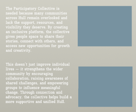
As a reminder about the project, the Collective was created to bring together both physical and virtual communities across Hull and offer a space where collaboration, creativity and a positive change can be made throughout. The organisation focuses on supporting the smaller community groups who often go unnoticed or lack the funding and resources they need to therefore be successful. By providing these groups with a platform, the Collective aims to enlarge and amplify their voices, share their experiences and help to build pathways toward better support and long term opportunities. The overall goal is to strengthen these communities, increase visibility, and encourage contributions which will and can influence change across the city.
The website I’m designing for the collective has been designed to introduce people to the organisation, showcase ongoing projects, highlight community stories and show the different ways users can be involved with the collective. I aim to make the site feel welcoming, easy to navigate, and overall supportive, ideas which help to reflect and remind the users of the collectives core values. The user experience should help users to understand what the organisation stands for, explore content at their own pace and feel comfortable when engaging with it, no matter if the user is new to the community or already involved within. The other goal I’ve been focusing on has been to create a space where users feel represented and acknowledged, especially those from smaller or lesser known groups who may not have an online personality and representation. The structure of the site has been designing to ensure it guides users through all important aspects such as the stories, projects and events, in my opinion, this helps to make the webpage feel natural and encouraging and not too overwhelming. The website should give people a sense of belonging and to display that their experiences matter.
Initial wireframes and layouts
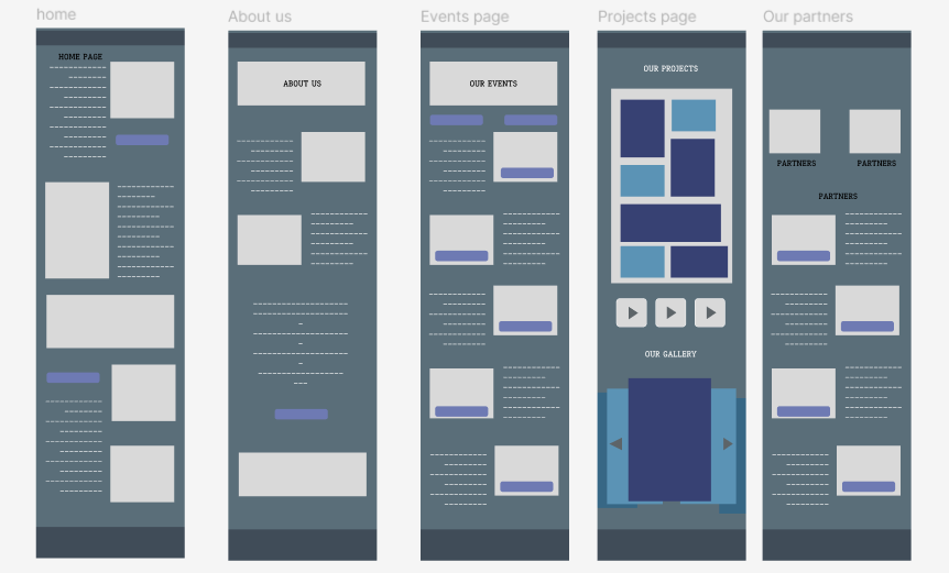
At the beginning of this stage, I used sketches and low fidelity models to experiment on all key factors, such as the design choices, elements and placement. From my early sketches, I focused on keeping a consistent design across all main pages of the site, which are the homepage, the projects and events page and the stories page. These are the core areas that help in representing the Participatory Collective, so maintaining a clear visual structure felt important from the start. The ideas in these early layouts are what I will be carrying on with when moving forward into the mid-fidelity stage, with each element placed strategically to support user attention and accessibility. One of my main priorities during the sketching and designing of the low fidelity phase was the navigation aspect. I want to design pages and layouts which makes the movement across the site straightforward and understandable for all users. My aim is to make sure that the users are able to find out key information and to understand where to go next, helping to guide them across the whole web page. I want the user to explore at the right moments and at their own pace. This early planning has helped me to then shape out a layout which feels simple, clear and user friendly.
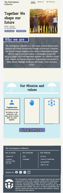
This is my early on design of the homepage layout for the Collective website, with each accessible element placed with a purpose and a meaning. As soon as the users land on the home page, they’re met with the first Call to Action button, which has been positioned centrally at the top of the page. I chose this placement so users immediately understand how they can get involved in the project or take part in any future events. It works as an early prompt and something that’s repeated across the different pages to keep involvement visible and accessible. This also helps to increase the user engagement across the site. The user’s journey is designed to guide them down the page, where all the key information about the Collective is introduced to them. By the time they reach the middle section of the home page, the layout opens up into a range of different buttons and information points, this then allows the users to choose their own direction. This supports people who prefer quicker navigation and want to explore a specific area of the site. My overall aim is to lead users through an initial guided path and then let them explore the other pages in a way that suits their needs and interests.
The “about us” page is accessible to users from the start, this appears as one of the first buttons the user can interact with. This gives them the option to explore a more detailed explanation of the Collective and its purpose. From this point onwards, the users can learn about the organisation’s aims, the partners involved, and the overall impact of their work. When designing this page, I kept the same structural choices that I used when designing the homepage. This includes placing a Call to Action at the top as the first interactive element, and keeping the text and images centred to create white space, which helps to prevent the layout from feeling overcrowded. The aim was to maintain consistency while ensuring the page remains clear, welcoming, and easy to read.
The next page is the events page, this page has been designed in a way in which everything is simple and neat from the beginning, I wanted this page to be the clearest as this is how the users can learn about future events and therefore be involved with the collective. I placed each events tab alongside a button so that the user is given the option to explore into more detail if they are interested, this is the same style and layout I have used for the partners page. As this is only the basic structure and layout of the design, there is no specifics available but as this changes, the design will look clean and approachable, values that the collective stands by and teaches.
Figma Prototype Walkthrough
My mid-fidelity prototype builds on the initial sketches and focuses on structure, flow, and overall usability. I designed each page with the same cream background colour, this is so I can concentrate on layout before introducing final visuals or branding, however this choice of colour works well and something that I found worked well when receiving feedback about the overall design. The homepage establishes the main structure that I will use across the rest of the site, including centred headlines, a clear Call to Action at the top and a simple scroll that leads users into more content as they navigate through. From the homepage, users can move directly to the “Our Story” page, the Projects and Events page through the buttons and top navigation bar, in addition to this, the footer at the bottom of each page also has a range of different buttons which can be used as well. As the user scrolls down, they get the chance to access other pages such as the events taking place in their local area and the gallery featuring images and user stories.
The different pages connect through a straightforward journey, the users begin on the homepage and are then free to branch out into the areas that interest them most. For example, half way down on the homepage, users can access more information pages through the available buttons, which are easy to identify and interact with. Placing these buttons at the start of the webpage also helps to integrate the idea into the users head, something they will think back to when scrolling throughout, almost as a reminder.
After visiting the home page, the user will navigate their way onto the “about us page”, which provides further information about the collective and includes drop down boxes with frequently asked questions, some videos linking to the collective. Once the user reaches the bottom of the about us section, they are then lead onto the next page which talks about the partners of the collective and the work they do in and around the community. Following on from the about us page, the user will reach the next point of the web page which talks about all the partners who are involved within the collective, providing a brief overview of each partner and how they work within the collective. This also gives the chance to the user to understand how support does in fact make a difference in and around the community. So far the user navigation is simple and should not cause any confusion for the user no matter on their technical skill set. Across most of the pages features a divider which mentions how the user can join the newsletter to get weekly information about the collective, this has been specified clearly to the user, allowing them to easily navigate to signing up. Once they press the button they will be taken to a simple page asking them to sign up via email or phone number. Other options available consist of apple log in, Facebook or google, this will benefit those who want a quick and simple sign up process.
To reduce confusion during the user journey, I decided to include a set of footstep icons. These work as visual guides which leads the users through the content, especially on pages that has a lot of text, causing the layout to appear and feel overwhelming. The footsteps act as a tour guide by pointing out to the users about the next section they should look at, this then helps them understand how to move forward to related pages. I’ve implemented this idea on the Partners page, the icons guide users through the different partner organisations and the work they are involved in. This approach helps to ensure that important information isn’t missed and makes the overall experience feel more directed and engaging.
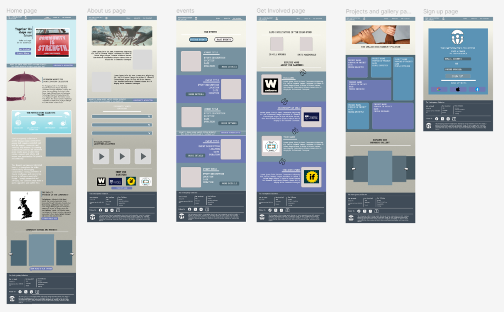
All my main mid fidelity pages featuring the home page, about us, events page, get involved page, projects and the sign up page.
Call to Action
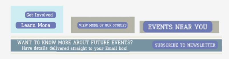
A key part of my CTA strategy is about reminding the users to get involved with the Collective’s work and stay informed about upcoming events. Throughout the website, I’ve included a range of buttons that appear on multiple pages, meaning that users will always have the option to explore more, no matter the page they are viewing on the webpage. On the homepage, a “Find Out More” button is featured at the very top, this is because this is the first action I want the users to see and interact with. Other CTAs across the site include “Future Events,” “Find Out More” and “What’s On,” each designed to guide users toward different areas of engagement. To reinforce the idea of involvement, I also added a newsletter section that appears as a divider on most if not all of the pages. This includes a short description and a clear “Subscribe” button, this offers the chance to the users about being involved with collective events and weekly updates. Positioning the newsletter CTA at the mid point of the pages acts as a repeated reminder that users can stay connected and become part of the ongoing work. This approach helps to keep the users engaged with the webpage, but without being too distracting or repetitive. I’ve also chosen to include secondary CTAS and a few more options placed within the footer, to reinforce the idea of reminding the user about the collective and the support that the user can provide. At the mid point section on certain pages the users can find buttons such as “projects in the area” and “attend event”.
Users are likely to engage with these CTAs because each one clearly communicates the interest and answers the users will get when clicking. For new users, the homepage CTAs help answer any early on question such as, “What does this organisation do?” or how they can be apart of the collective. By implementing buttons such as “get involved” or “see upcoming projects”, users can quickly access content that feels most relevant to them, whether that’s learning about the Collective’s work or seeing how the projects benefit the community.
User-Centred Design Decisions
The personas I developed in my earlier project helped to shape most of the structure and tone of the website. These personas worked well as they were a place holder for possible users who maybe using the website, with each profile having their own skill set rating for technology usage and understanding. From this I understood how to design the webpage and cater to all users technology skills. For example, one persona emphasised efficiency and clarity, the site design caters to these type of expectations and avoids long paragraphs on the main pages and instead uses short sections with headings. This lets users gather key information quickly, especially if they are looking for specific details such as upcoming events or about collective information.
One of the main criteria’s I was focusing on when planning and designing the webpage was the different accessibility features I could implement to ensure that the user experience is the best it can be, for all users accessing the site, especially with inclusion being one of the main beliefs and ideas of the collective. The text across the site has been sized reasonably as this helps with comfortable and easy reading, whilst heading and sub headings are sized bigger to ensure that the user can understand the difference between information text and headings/subheadings. I’ve focused on line spacing on any larger pieces of text as this helps to shorten the text down and makes it easier to process for users who may suffer with dyslexia or visual difficulties. For the early design stages, I chose a cream background for all pages to keep contrast high before the final branding is applied. This helps ensure that users with vision impairments such as colour blindness can still read content without strain.
The interactive elements that are available across the webpage are all spaced out and labelled clearly, making them easier to use and understand, this will also make it more simply for users using a mouse to identify and click on. The buttons that are included on the different pages all include text such as “click here” or “find out more”, which improves the navigation aspect. All the content on the pages are arranged into a logical order, for example placing explanations before images or links on project pages so that the users can follow information step by step. Which also helps with the user journey idea and reduces the chances of confusion.
The tone of the website is both warm and welcoming. I avoided being too formal with the text and chose short paragraphs when appropriate, because this can help to reduce the chances of confusion. In my opinion, the writing feels friendly and approachable, which are both core values of the participatory collective. I want the users to feel comfortable and included as soon as they arrive on the home page. The warm and friendly tone also reflects the collectives values about being open and supportive, this is important as I want to make sure that the users feel respected and encouraged to explore more of the website.
Feedback & Iteration
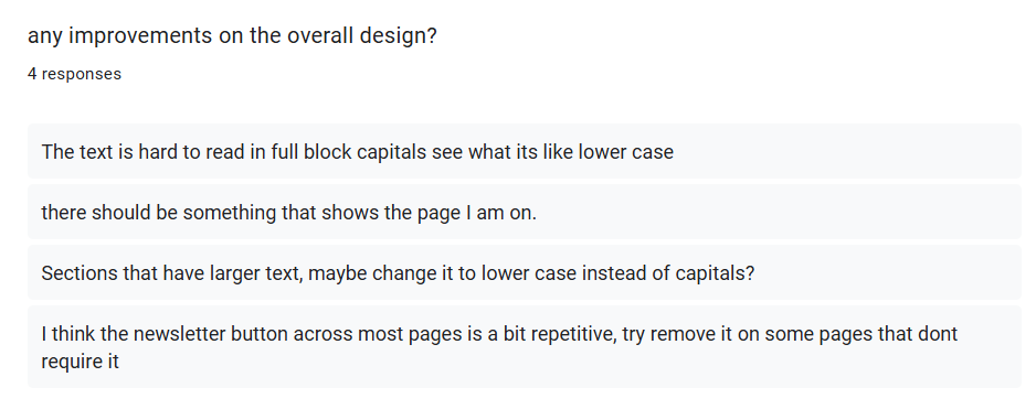
After completing the design and layout for each page, I used a google form to collected feedback from friends and peers to understand how the sites usability and experience could be improved. A recurring point of feedback talked about the use of full block capitals in larger sections of text. Two people commented about how the capital letters made the paragraphs harder to read and felt visually difficult on the page. I tested their suggestion by switching these sections to lowercase, and it immediately improved readability. Because of these responses, I updated all longer text blocks to lowercase, which made the content more approachable and reduced the strain on the user when scrolling through information.
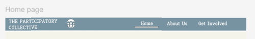
Another piece of advice and improvement I received was about informing the user about the page they was currently on. Some users may be confused about the page they are viewing which could cause them to miss out on certain information. To reduce the chances of this happening I had designed a small underline in the navigation bar to showcase what page the user is currently on, with the line moving across correctly to indicate the page the user is viewing.
Not all the feedback I received led to changes in my mid fidelity design. For example, one person suggested that I should remove the newsletter divider which appears on multiple pages because they thought it was too repetitive. However, I decided to keep this feature as the newsletter is one of the main call to actions on the site, and seeing it more than once supports its purpose. In my opinion, the repetition isn’t a negative because it helps reinforce the idea about getting involved but without being too distractive for the users and does not disrupt the user journey and navigation.
Ethical & Sustainable Design Commentary
From the start of the project, I approached ideas of both ethical and sustainability. I focused on trying to reduce the sites carbon and environmental footprint, to do this I reduced any larger sized text that wasn’t as relevant and chose a light colour scheme to reduce the amount of energy usage. When going forward and creating my high fidelity design, a darker colour scheme option is something I could look to implement as another option of reducing energy usage, this may also help and benefit those who may face visual strains when looking at brighter schemes.
The people and community aspect will be placed within the gallery section of the web page and images will not just be used as a place holder. Its important that real life images of the collective work are used as this helps to create the warm feeling I aim for, users will connect with the collective more if they can see real time work and the positive impact that the participatory collective can have on members lives and on the community. These images will help to reflect the real effect that the can be made within the community.
References:
Icons8, used to get different icons across the design, such as the social media icons. Free Icons, Clipart Illustrations, Photos, and Music
Images featured across the web design under the community category: Unity in diversity
Wellcome logo screenshot: Home | Wellcome
The ideas fund logo screenshot: The Ideas Fund | Home
University of Hull logo screenshot: Unsame Old Story | University of Hull