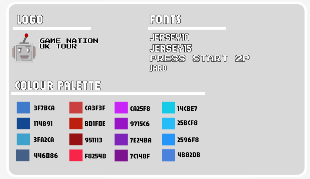
The design of my mobile app has been inspired by a retro gaming aesthetic. This theme consists of a look related to the likes of classic arcade games, I’ve chosen a colour palette which has been dominated by shades of blue, red, and purple. The typography Which features in the app includes pixelated fonts, as this follows the idea and aesthetic I was aiming to create. I believe that the colour scheme and typography style create a strong personality for the event and app.
To make sure that the design choices matched with the with user expectations and requirements, the research and questionnaires I had created where helpful and providing a huge amount of input for me. The feedback influenced a lot of ideas throughout the whole design process but was hugely important in shaping the idea at the start of the design process. The answers received helped me to select not only the colour palette, but also the typography which features all the way through.
The typography that I have used throughout follows the same style, with this chosen style being pixelated, the reasoning behind this is due to this fitting in perfectly with the whole video game idea. In my opinion this is something that can be appreciated by the potential users and gaming fans, the selection of fonts work well with the background, and despite the blocky style, these fonts are still clear and readable for the users, causing no possible confusion.
The designed layout on both mobile and web page both include a consistent layout, these layouts are designed to avoid any possible confusion, designing more simplified layouts to ensure that the users can efficiently guide their way through both app and website. When doing research on similar apps, I found that some layouts can be seen as a maze, making them a pain to navigate, issues like this provide the user with a poor experience overall, and is something that I made sure to avoid.