During the planning phase of the app’s design, I wanted to outline and display key responsive features, which will help with the user experience. The first set of interactive features and elements can be seen on the log in page. This is due to selected buttons appearing darker compared to others on the page. This responsive feedback is used consistently throughout the app. Features such as this are designed to guide user through the interface, helping them to understand what has been selected. This feature boosts usability across the app.
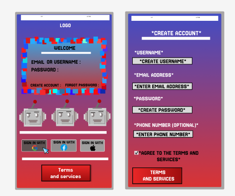
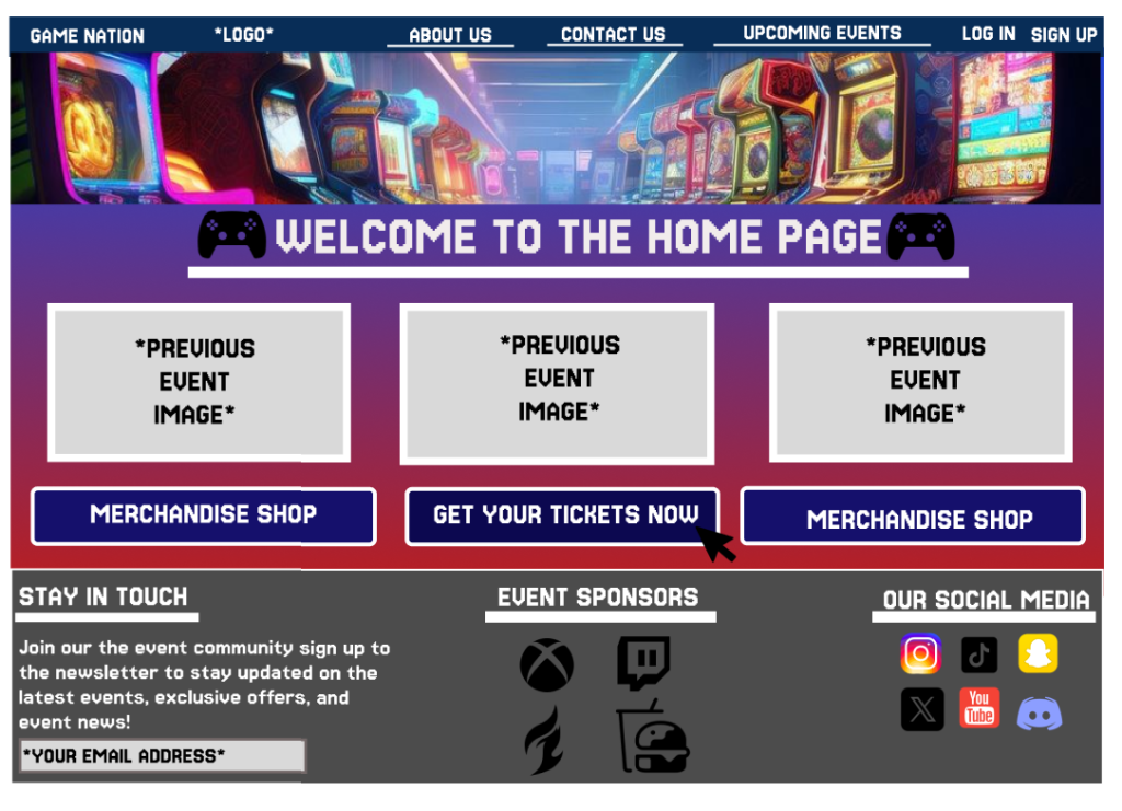
When progressing past the login screen, users are transported to the home page of the companion app. This landing page displays key event information and helps with user engagement. In the centre of the screen is the “Purchase Ticket” button, placed at the start to help with quick progression for users wanting to get tickets fast. Offering a smooth onboarding experience.
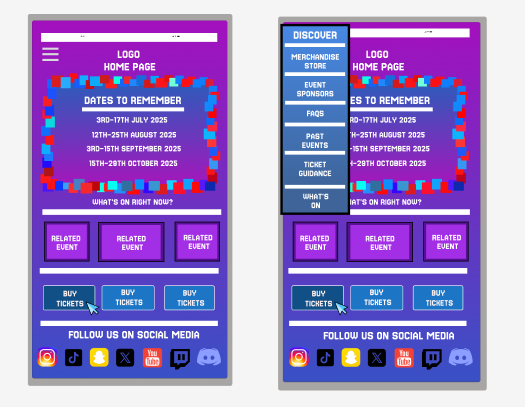
If users wish to explore throughout the app, a menu is neatly placed in the top right of the page, when clicking the drop down menu is presented to the user allowing them to visit a range of different areas that the app has to offer. The button selected will again change colour to indicate to the user about their selection choice.
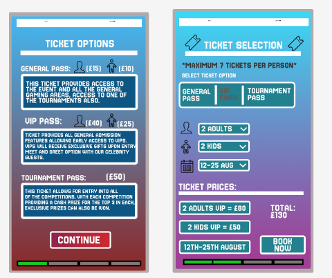
When the user click the purchase ticket button, they are transported to a page which displays the different ticket types that are currently available. Clicking “continue” will allow for the customer to customise their event selection. Users can chose the ticket amount and the day they wish to attend, allowing for a more responsive design. Ticket pricing is placed at the bottom to help inform the users on their ticket price. A progress bar is included to help guide the user through their purchase.
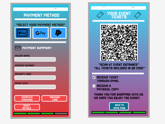
The last set of responsive features can be found during the final stages as the user chooses their payment method, with their selection being a different and darker shade colour. On the ticket page, two preference questions are available, implemented to improve the user customisation and response.
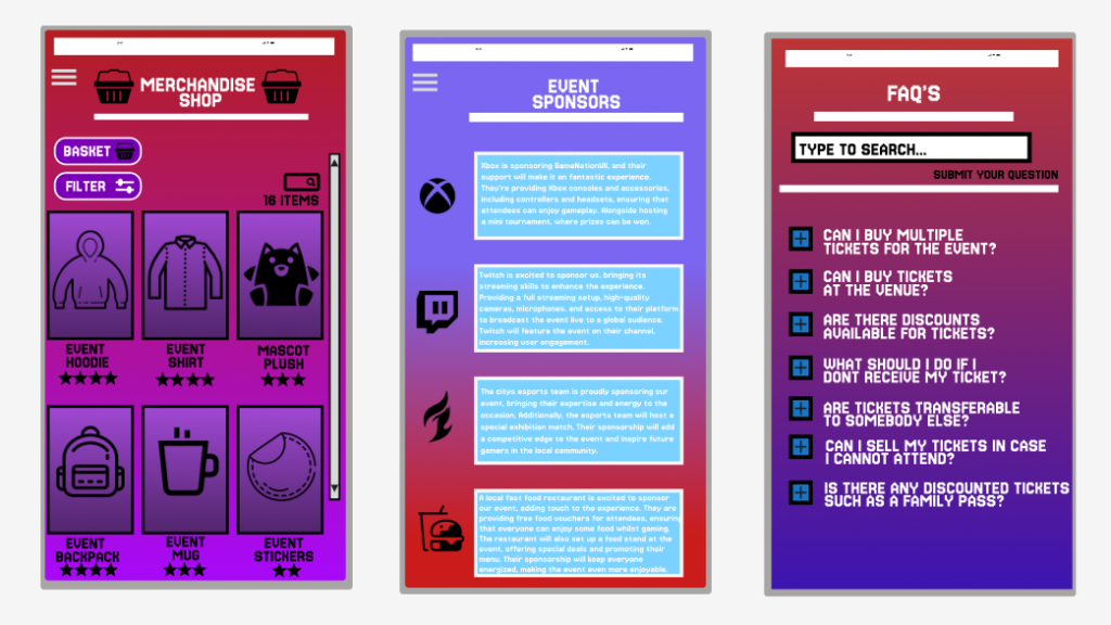
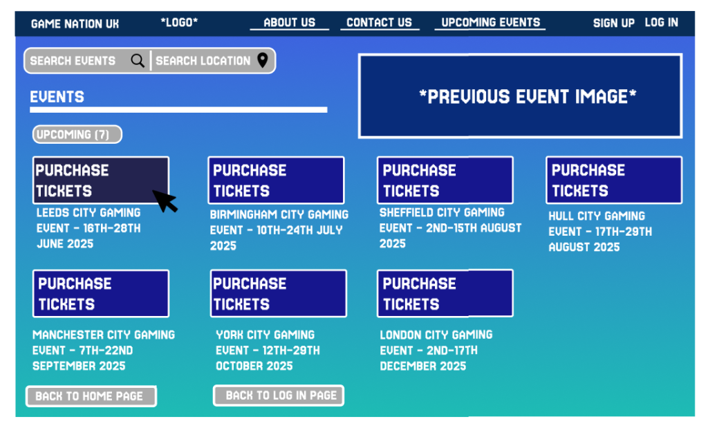
When the customer opens up the events web page, they are met with a large range of buttons which all posses a different page. To be consistent between both app and web page, selected buttons appear in a dimmed version compared to the rest. With all the menus within the top bar being used for transportation to other pages.
When using the ticket button, the user is taken to the ticket page which offers a great range of responsive features. The customer can choose the event that suits them the most, or can use the search by location feature placed at the top of the page, and selecting one of the dates takes the user to the final three steps.
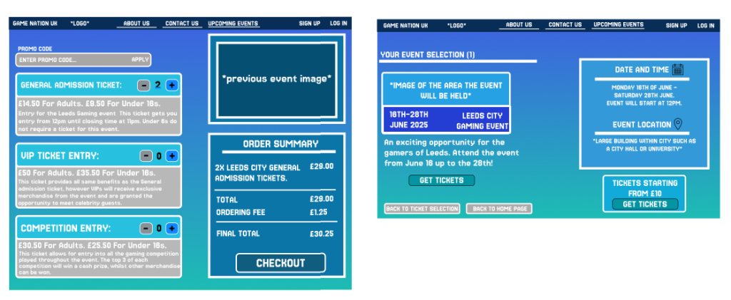
The ticket page allows for more of a responsive design, as users can add or minus a selected ticket and have the option to choose between the three different ticket options. The order summary is important as it helps the user to understand how much the total price is, adding towards a quick and efficient experience.
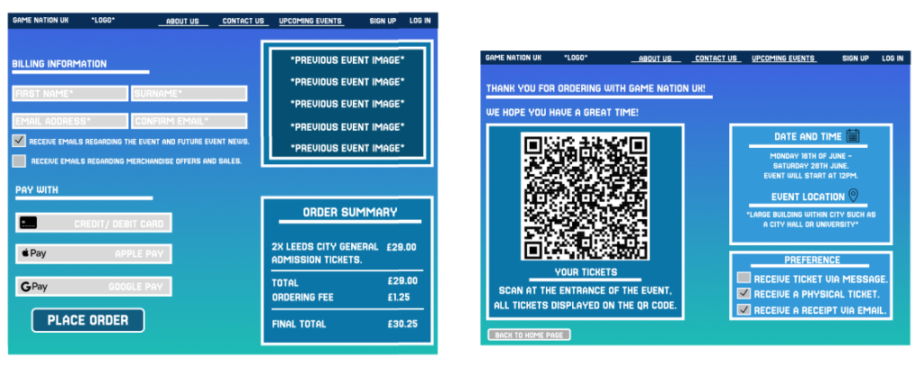
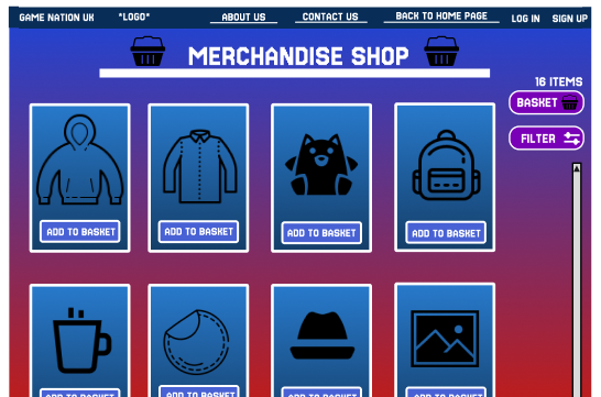
Image used within the website home page. Found at Arcade Game Machine Images | Free Photos, PNG Stickers, Wallpapers & Backgrounds – rawpixel.
App and web page layout created using Figma.