After finishing with the colour scheme and pattern elements, my attention was directed toward the typographic side of the UI design. Typography plays an important role in both web and app design, Providing a greater larger importance than the selected colour scheme. Whilst the colour of the site or app helps with the visual appearance, the typography affects how the user can react to the app or web page. Choosing a poor typeface can potentially cause the users to look somewhere else, resulting in the loss of possible customer. The chosen type face must also be compatible with every device available.
When planning the typographic style for the design, I aimed on creating a certain identity for the design, searching for fonts that were bold, large, and pixelated. These styles were what I wanted, to help enhance visual impact, causing the text to stand out. Bold and enlarged typography helps towards improving the overall readability and user experience. The pixelated aesthetic works well and is well known within gaming culture, fitting in well with the event.
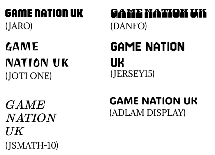
I followed the same approach to what I used in Post 3, when deciding on the correct colour scheme. I created a questionnaire and once again shared it across different social media platforms. Participants were asked to select a font a which they felt would work the best to fit in with the criteria of a gaming event companion app and web page. This helped me understand and collected user opinions, ensuring that the chosen typography style benefits the user engagement.
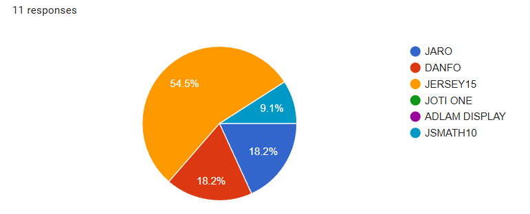
The results from the questionnaire shows that over 50% of respondents identified as the most appropriate font for the event’s companion app and website. This font is a good representation of the gaming community as it displays the pixelated look I was aiming to achieve. For the UI design, this font can still be seen as readable for the customer base, ensuring accessibility and ease of reading for users on different devices.
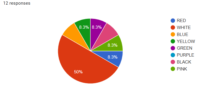
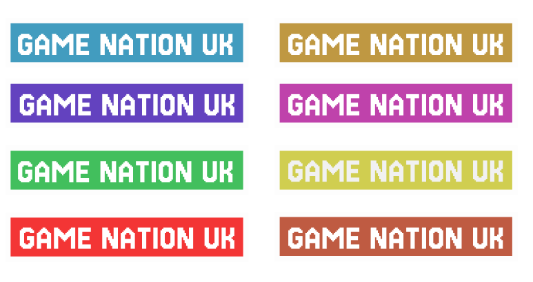
After deciding on my font, my focus was on the text colour for both the website and companion app. The first idea I had involved using a dark colour, such as black or grey. However, this colour scheme may cause visual issues and reduce readability when used with certain background elements, particularly a vibrant themed interface. Once again I asked a small sample group, to help me gather feedback colour options.
All my research has been done through the use of reddit and discord. Whilst the diagrams was created through google forms.