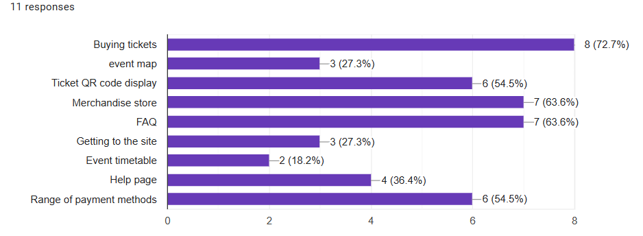
When understanding the criteria and expectations based on the feedback from the web page. I used the same method to gain an idea on what potential customers expect when they try out the events companion app. The questionnaire created follows the same format as the website questions, as I expected the answers to vary between both the web page and the companion app. My first question was based on what the customers expect to be prioritised when using the companion app. When compared to the websites responses, the companion app expectations are different. However just as before, buying tickets is still the main focus of the customers once accessing the events companion app. With how the customers receive their ticket also being one of the top priorities.
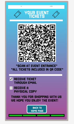
Following the collection of user feedback, I focused more towards designing a webpage that displays the users tickets in the form of a QR code. This feature makes accessing the tickets much more convenient. However, alternative preference options will also be included ensure and satisfy all customers.
The next question on the survey is focused on exploring the potential functions that could boost the interactivity of the companion app. Specifically, whether to include a calendar feature, something that the target audience may find useful. The calendar feature would be used to inform users of the upcoming events. By providing a visual layout of the event days, this would help users to quickly view dates that might interest them. Assisting them to proceed directly to purchasing tickets. Boosting user engagement.
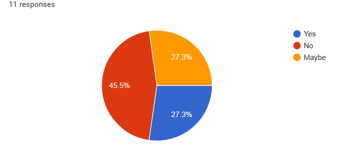
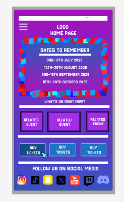
However, when obtaining the data, users would prefer there not to be an option such as a built in calendar. Possibly allowing the users to find an event that suits them the best, without needing to search through a calendar. To satisfy all the customers, a dates board will be included into my mid fidelity prototype, to assist users who may need a board advertising upcoming event dates.
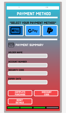
The final question I asked was regarding payment methods used within the app. As different payment methods have become widely available, I wanted to see if the inclusion of this would prompt a user to choose my app and purchase a ticket for the event, due to the range of payment methods accepted. A range of payment methods was something I did not cover within my low fidelity model but might be included within my mid fidelity prototype.
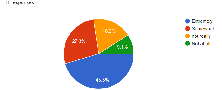
Majority vote displays that users are more inclined to use an app if a variety of payment methods can be used. With the biggest methods being apple pay, google pay and PayPal. These are three methods that can be used to improve my companion app.
*All designs have been created through the use of figma. Data has been collected by questionnaires built using google forms, google forms has then turned this data into a set of graphs.