Conducting research into the preferences of the target audience is an important when designing an event website. Gaining an valuable insight into what the target audience expects when it comes to both the design and content of the site. If the website’s features are not up to the expectations of the audience, the event is at risk of failure. I created a short questionnaire to obtain my answers. My first question asked about the layout and style the users expect when it comes to the home page of the website, with the two options discussing a high amount of images and elements, or a low amount simplistic design.
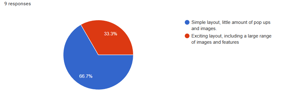
When receiving the results from the first question, the target audience expect a simply layout, something that’s not too distracting. As 66.7% of the responses indicate this. I will aim to design my websites landing page in a simplistic style, something deemed as not too distracting, possibly containing one or two relating images. This is all helpful data which can be used to improve the low fidelity prototype.
The second question from the list is based on what the users wish and want from when using the website, such as the different pages and options they are able to browse. This is important as it helps me to understand which areas of the website I should be focusing on, designing the areas that will please the customer base the most. Putting in less time into areas not that many users want within the website.
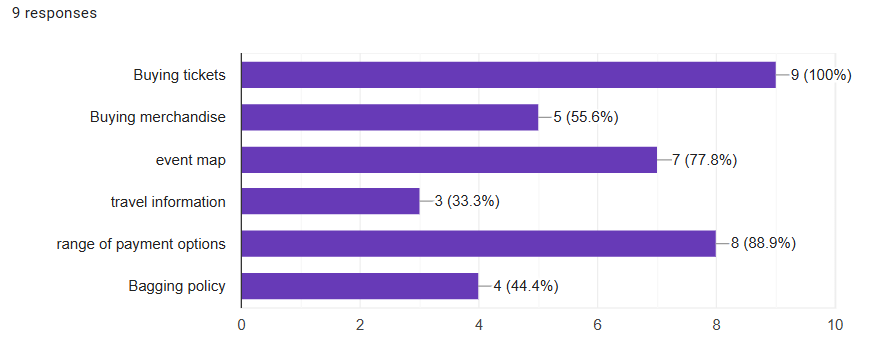
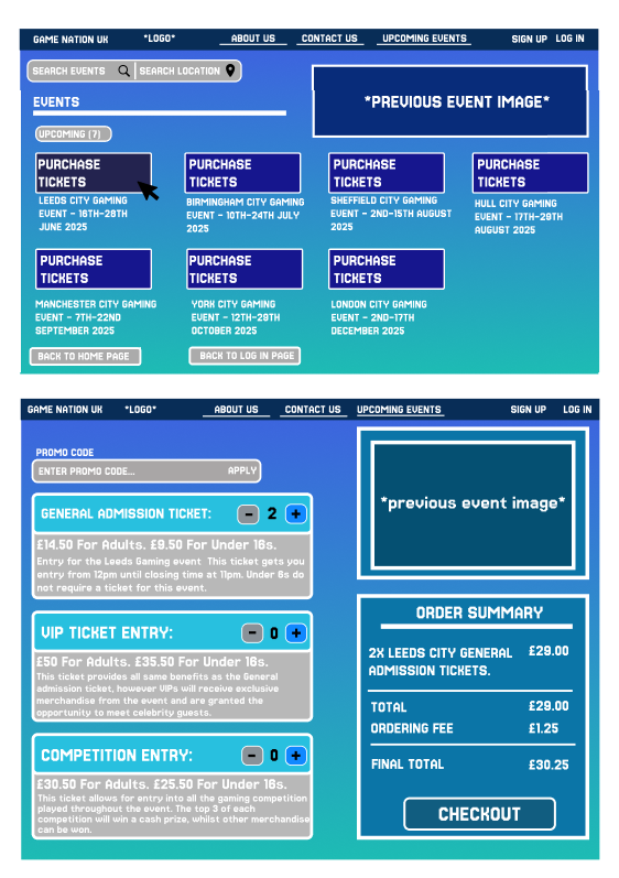
When reviewing the answers received, its clear to see that the most important aspect of the website in the eyes of the customer base is the inclusion of purchasing tickets, as all 9 people selected this option. Other popular answers consist of payment options and an event map. Something I can implement to improve the users experience when browsing my web page.
The third question answered was based on the ticket quantity, aiming to understand from the users perspective, how many ticket types will be seen as acceptable, and not too over the top. A range of tickets provide good options for the customer, but too many can be over the top. Potentially off putting.
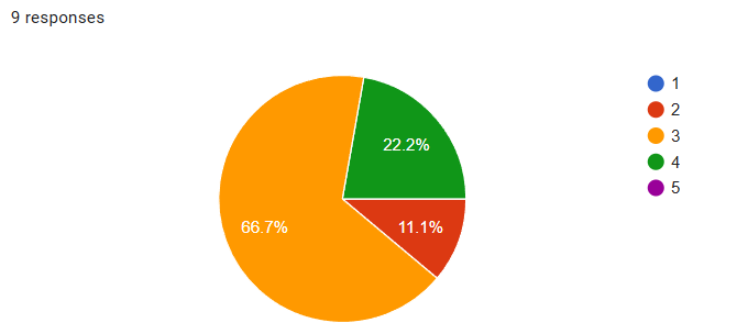
Majority of the votes decided on three tickets being the right amount to select from. As this can be seen as not too many, nor to little. Feedback such as this improves my designs, especially in the low fidelity prototype, as five ticket options was previously an option.
*All graphs display had been used from collected date through the use of google questionnaire.
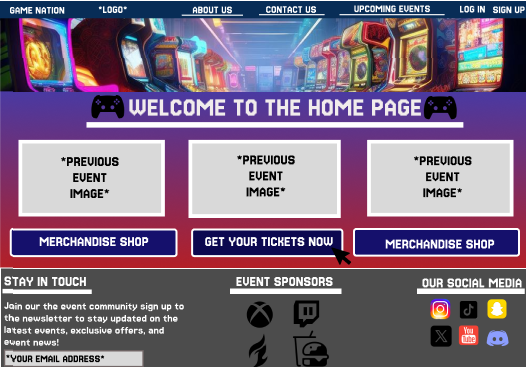
Following on from the first question, I decided to follow the majority vote and stick to a landing page which can be seen as simple. My home page has basic layout with the use of one image, and a small selection of elements. Avoiding a loud and over crowded layout. I prioritised areas such as ticket selection as results displayed, users believe this is the most required section of the website. With information such as bagging policy not getting as much attention within the site.