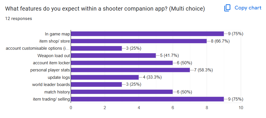
I have been chosen to create both a companion app and a website based on a shooter game named Eco blast, the game is a online multiplayer game were each gun and bullet provide elemental effects, this game is my idea and not something already available. The purpose of this companion app is to help improve the experience and overall reaction to the online shooter game, “Eco Blast”. This has been done by offering tools that are noted as missing within other gaming companion apps. Features such as trading menus, customisable weapon loadouts, in game maps and match history are all included. My app will is inspired by feedback I’ve found by researching within gaming communities and has been designed to meet the needs of both casual and competitive players. Additionally I gained input from people in this community, for a better understanding, through the use of google forms, these forms shared through reddit and discord. This helps to gain an input into what the potential users expect and want within a companion app. The main target audience for this app will be those over 16, as the game features guns which can be seen as a mature theme. Whilst studies from 2024 show, 35-44 years old is the largest demographic of people playing shooter games, with 80% of men preferring shooters over any genre. Meaning my ideal target audience ranges from males 18-44 years old.
During my research, I reviewed apps such as the Call of Duty Companion App, FIFA, and Destiny. All provided basic information and detail such as basic stat tracking and account layout/preference, but all lack basic user experience features. This leaves a big gap in the market for a good UX app within the industry and something I can take note of when progressing with the designing of my app.
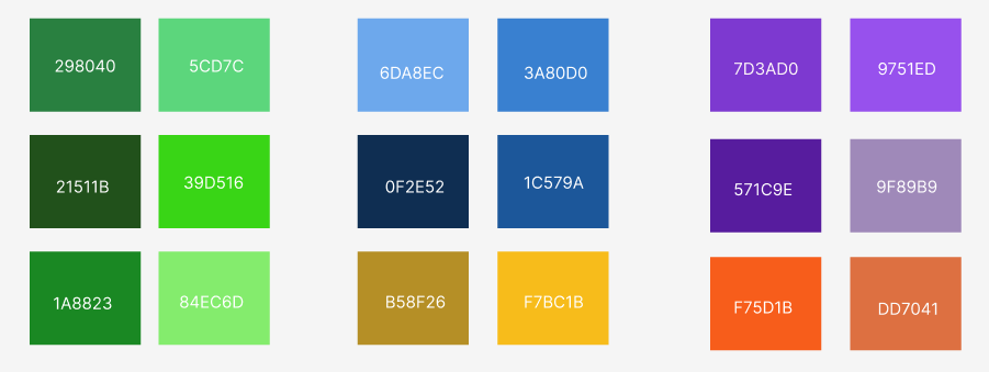
For the featured colours within the app I aimed to keep a consistent colour scheme all the way through the companion app, whilst carefully selecting pallets that work well on the eyes, avoiding any confusion by the user. But this colour pallet also needed to symbolic to what the game is about, as the game follows a nature and elemental aspect, the most frequently used colour is green, ranging from light neon greens all the way down to the darker shades, yet still being viewable for the viewer. These schemes can be expected through the use of backgrounds and buttons. Similar to this, the selected font will be something that I believe carries a gaming type of feel to it, something possibly featuring a pixelated style, with the colour prominently being white.
References
Gaming statistics found at, Video Game Demographics 2025: Who Plays Video Games? – EarthWeb. Accessed (20th April 2025)
Google forms, used to created questionnaire.
Reddit and Discord