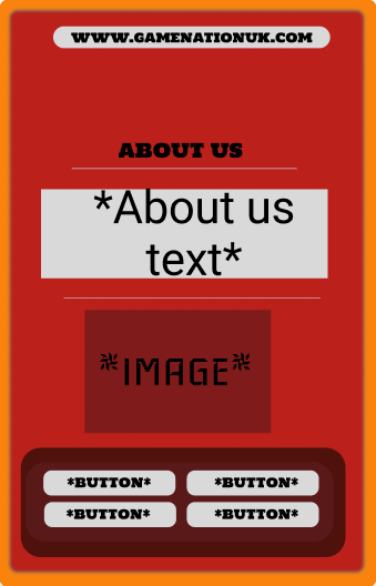
When planning my low fidelity companion app layout, I had designed a range of different features such as colour schemes layout and buttons. The first few attempts made had a range issues yet some areas I had designed have been used when creating the first real prototype of the companion app. The main outstanding issue regarding my first attempt was the colour scheme I had decided to choose, The bright red and orange does not make my design look professional, in fact this made the website look unserious and untrustworthy, the customers may see this is untrustworthy therefore looking away.
The ticket page followed a similar colour scheme and layout to the home page, yet all the buttons and information is centred. Laying out the information like this caused the layout to appear squished together with not much room for the ticket description and price. Problems such as this is what causes a range of issues for the users, leaving them to potentially make a mistake or not being able to obtain the information at all. The main idea for the app is to purchase tickets whilst understanding what benefits each ticket type provides, without this the app and event will ultimately fail at the first hurdle.
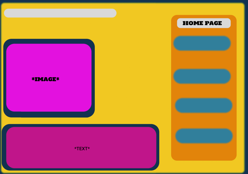
Other alternative designs had been attempted yet was quickly rejected, the main reasoning being down to the use of particular colour schemes. Although the layout on this attempt proved to be successful, the colour scheme was the centre of attention negatively. I had attempted to integrate colours that are known and often associated with video games and gaming as a whole, for example a range of neon greens, yellows and purples. However this was rejected due to accessibility reasons. Bright and heavy saturated colours may appear as difficult to see for individuals who has visual impairments. Meaning, these colours had the potential to cause confusion and possibly discomfort, effecting the users experience with the app.