I have chosen the World of football to be my subject, with the aim of my selection to be promotion, helping younger people to understand and get into football. When searching for typography within football, big sports brands such as Nike and Adidas being the most noticeable ones, often produce posters and advertisements on a product or special event which will be taking place in the near future. In my opinion, the best designed posters and advertisements come in the shape of football boots, posters displaying the look, material and the quality. The poster I have chosen to focus on the typography of is a poster displaying a new range of boots released alongside a set of quotes in bold writing and a variety of fonts.
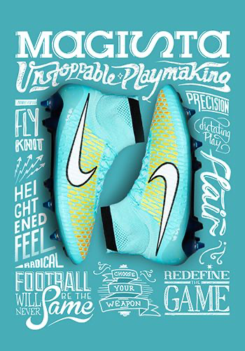
The reason I have chosen this poster to focus on the good typography, is due to the design pattern and placement of the accompanying text placed around the football boots, being displayed from the top of the page directly to the bottom. With the quotes all displaying quotes which relate well with football, whilst also promoting the boots and informing the potential buyers on why they should be buying these nike boots.
Quotes such as “heightened feel” and “unstoppable” are a perfect choice of words to describe what the customer will expect upon buying these boots. All of the surrounding text is placed in a different yet readable font, ranging from cursive to a bold font. In my opinion, the reason Nike have chose to use this tactic, is to create a representation of the new release, displaying that the boots are bold yet can be classed as a high end product due to the inclusion of the cursive fonts. One small detail I believe Nike could improve on was the chosen font of “Magista”, the side ways “s” may cause confusion especially to those who may be unfamiliar with the given name for the boot.
Bad Design
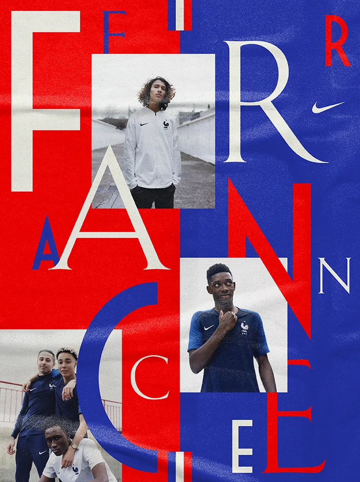
The reason I have selected this poster to be a bad example of typography is due to the layout of the text an image placed all around. In my opinion this is a poor example of typography due to the confusion that could be caused when trying to understand the text and what the poster is a representation for. The issue with this poster is that the letters spelling “France” had been placed all across the poster. This therefore caused me to be confused on what the poster was trying to say. Although I understood what the poster was representing based on the players selected, viewers who may not know the French players can be left feeling confused as the aliening text does not match or set within a readable manner.
I believe that there are multiple ways in which this design can be improved. However, areas of the poster which do work well, include the style of the font alongside the chosen colour scheme. The colours work well as the three colours selected are the colours which appear on the French national flag. The changes I would make are simple, which is different due to the complexity of the selected design. In my opinion, if all the letters had been lined up or placed vertically, this would make the poster look much more readable and presentable.
References
Figure 1. Nike (2015) (Image found through Pinterest) https://uk.pinterest.com/pin/442971313334992996/ (accessed 2nd October 2024)
figure 2. Nike (2018) (Image found through Pinterest) https://uk.pinterest.com/pin/marcarmandnikefffgraphicdesignitsnice…
Designer Marc Armand (2018), created ahead of the World Cup. https://www.itsnicethat.com/articles/marc-armand-tu-sais-qui-convo… (accessed 5th October 2024)