When first deciding on how I wanted to design all my cover designs and information pages, I wanted to focus on creating each design in a similar fashion. The approach I will be taking with this project is to create magazine/ comic books which can be enjoyed by younger children, which feature topics such as players, goals, football boots and a large range of other related topics. With most comic and magazine books, the typography is a leading factor to understanding what a certain book will be discussing and the main topic. For example, comic books implement a set style of typography, usually a style which can be seen as bubble writing, big bold writing, easily readable and noticeable for this type of genre. Not only will this type of typography match with the designs I am aiming to create, but the bubble writing type of designs and fonts will be seen as more attractive to the younger children, as being bold will stick out to them.
Each bit of typography used within my designs will follow a similar colour pattern to which the designs in covers and information page consist of. Using this colour scheme, in my opinion will cause all of my designs to look more organised and make them appear as real magazines which are seen in shops. For the logo that I will be using, this will follow a similar pattern in that the text featuring on the logo itself will be big bold letters, a design which is commonly seen within comic books for younger children.
When planning on the typography which will be used in all of my designs I trailed a range of designs which consisted of small text, colour text, cursive type fonts, however none of these designs fits in with my criteria compared to bold bubble writing type did. The main characteristics I aimed to reach with my typography is, large text to make sure its readable for all customers, a colour scheme which will not be too distracting and seem untidy when place don my designs and to implement typography which isn’t too large, leading to taken up too much space within my pages.
One of my early prototypes of making a logo with text accompanying it, was a simple sketch displaying the name of “Football Frenzy”, not only does this name work but the style of font matches up nicely with the name, keeping the design simple and compact together, whilst also fitting in with my own criteria being a pleasing logo for children but also a style which looks like it belongs within children’s cartoons and comics.
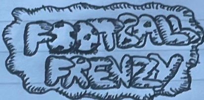
Not only does this design include the bold type face I aimed to achieve, but also integrates the two footballs in nicely, as a simple replacement for the two “o’s”.