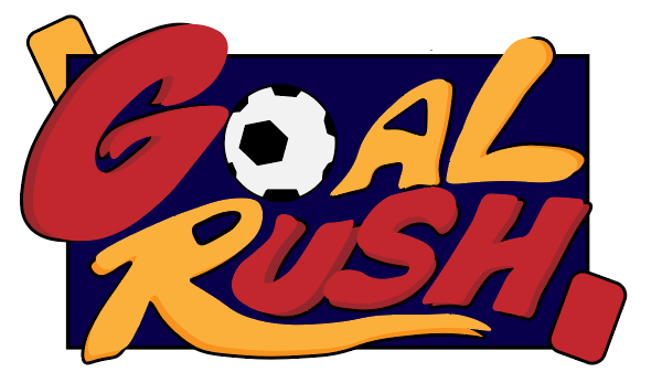
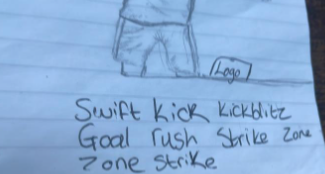
When design a masthead logo for my editorial spread, I created a clear outline with a range of features which included the name, the design, the colour scheme and the potential items that may feature within this design piece. My starting point, was about thinking and creating a name for my project and design, a name which not only stands out, but also is a clear sign to what my spreads and posters will be portraying . Some of the names that had been noted down and trailed consisted of, “Home of Football”, “Swift Kick” and “Strike Zone”, just to name a few. I landed on the name “Goal Rush” because I believed that this was a perfect example of understanding within an instant on what my spread will be about and the topic in which the consumers can expect to see.
After I had outlined the name I began to focus on the design of the logo with the aim of creating a logo which is bold and stands out to all the potential viewers. My target audience for all of my posters and designs had been outlined as a younger audience such as children from the ages 5-14, meaning I had to design a logo which would appeal to the younger audiences, something big and bold and associated with a comic book style. I believe I had designed a logo which accompanies the bold and comic book style of design.
The reasoning behind using the bold red and yellow is simple, these are the colours which I believe cause a design and a logo to stand out, some of the most popular brands always include a colour scheme which embeds rather a bright yellow or red within their logos, for example “McDonalds”, “Marvel”, “Netflix” and “YouTube” just to list a few.
When creating my finale logo I had sketched and designed a range of logos to try and find out which one works the best and would like it belongs within something such as a comic book. All of them had the same concept which included both a red and yellow card, however each design has its only different style and item. The card design was something that I decided on sticking with and features within my final logo design.
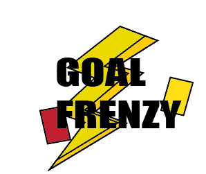
The is one of the first prototypes of the design of the Goal Frenzy logo, the reasoning behind the lightning bolt was due to football being a high energy game and the lightening bolt symbolises the energy side of the sport. The design itself looks basic and messy in my opinion, the typography is simple and placed in the middle, which causes this to then look disorganised and somewhat a lazy and quick design. Instead of using a bold black font I instead opted to design the the individual letters instead of typing the name up. Doing the letter in this form meant that I was able to gain the bubble type comic font that I was aiming for and envisioned in my design.
This logo and design belongs and was created by myself.