When trying to think of conceptual design in the world of football, my intention was to research trophies in the sport, this is because most trophies have a meaning to them which I believe works well to showcase conceptual design in sport. To discuss conceptual design in trophies, I have decided to choose the World Cup and all the hidden features and meanings implemented by the creators in Italy.
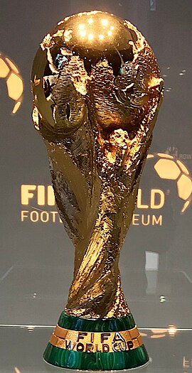
The reason I have chosen the world cup trophy to display a good use of conceptual design is due to what the trophy stands for and represents, from a first glance at the trophy, fans may gain the idea that the trophy is a simple, basic and a boring golden ball with a base. However a closer look displays a range of ideas which makes the World Cup a representation of all the fans across the globe. Starting with the top of the trophy, the dome at the top represents the world as a whole, including all the contents engraved within.
The main part of the trophy is the golden base, now the base is showcasing a pair of athletes either side of the trophy, which are stretching and reaching out in hope to be closer to the top of the globe. The purpose for both of these athletes stretching is a representation to the nature of football and the way we play. The creators of the trophy are wanting to advertise the competition which is found within the sport, show casing that all players at the start of their careers want to reach the top.
However that’s not the only meaning the World Cup trophy symbolises, the two athletes reaching out to the globe displays that they have won the all time best prize that can be won, flaunting that they’ve claimed and won the world. As the whole world is playing with the hopes of lifting the trophy, winning the entire tordument is extremely difficult task and only the best nation will be in with a chance to claim the world and therefore be at the top.
Bad Example

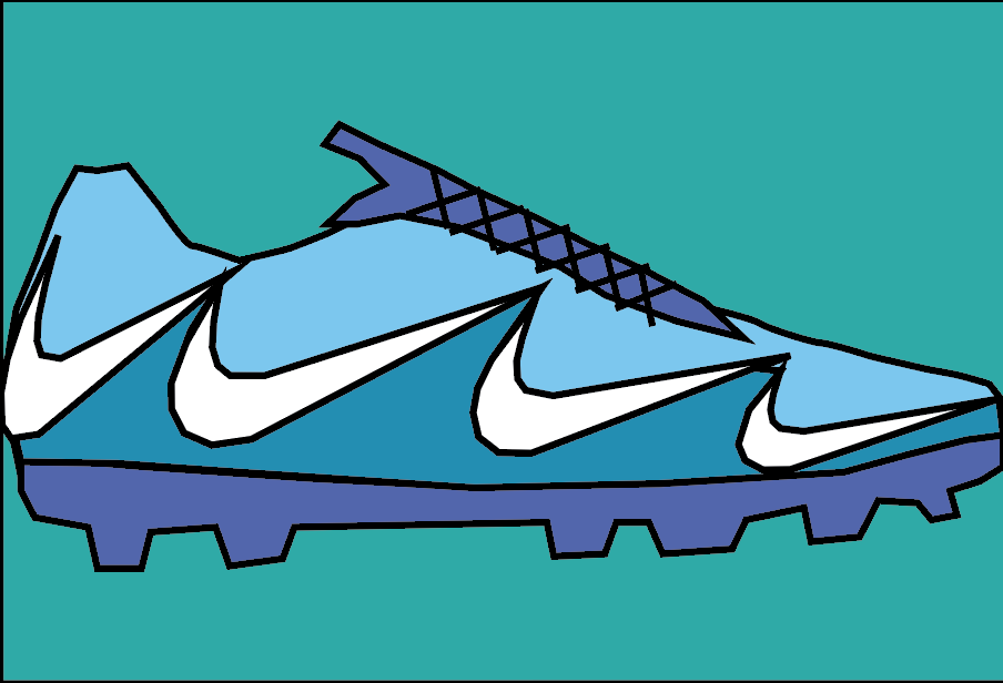
I have chosen to display conceptual design, is a advertisement displayed by Nike to celebrate the launch of new boots. The image itself displays the shape of the new red boots whilst including the Nike logo from the start to end of the design of the boot.
The reason I have selected this to be a poor design of conceptual design is because in my opinion, the design is unclear with what Nike are trying to advertise, at first glance, the design may seem as a representation of a fire due to the colour scheme that has been selected by the graphic designers. The one outlining feature with this conceptual design is the Nike logo, which can be seen across the shoe. The bottom black Nike tick is a great start to represent the sole of the boot, but from that point, the design has been created in a way in which looks unrecognisable.
When trying to recreate this image in a different way, I would keep the Nike sole tick at the bottom of the boot yet changed everything else. I intend to implement a style in which is much more simple and recognisable. Key areas I can work with in this image are the shadows which are placed just underneath the sole of the shoe, my intention is to change this to something which links in well with the idea of the football boot.
When trying to recreate the original Nike poster, I had made a simple attempt using the skills I have learnt so far, creating s boot using the pen tool, whilst also trying to simplify the poster I have chosen for my bad example. However this is a very basic attempt due to the skill set I currently have.
References
Figure 1. Photo released by FIFA (June 12th 2022) Wikipedia FIFA World Cup Trophy – Wikipedia (5th October 2024)
Author and photographer – Ank Kumar.
Figure 2. Logo created for Nike. Author – Iftikhar Alam. (Date unknown.) https://www.dreamstime.com/nike-logo-red-black-colors-displayed-pl… (5th October 2024)