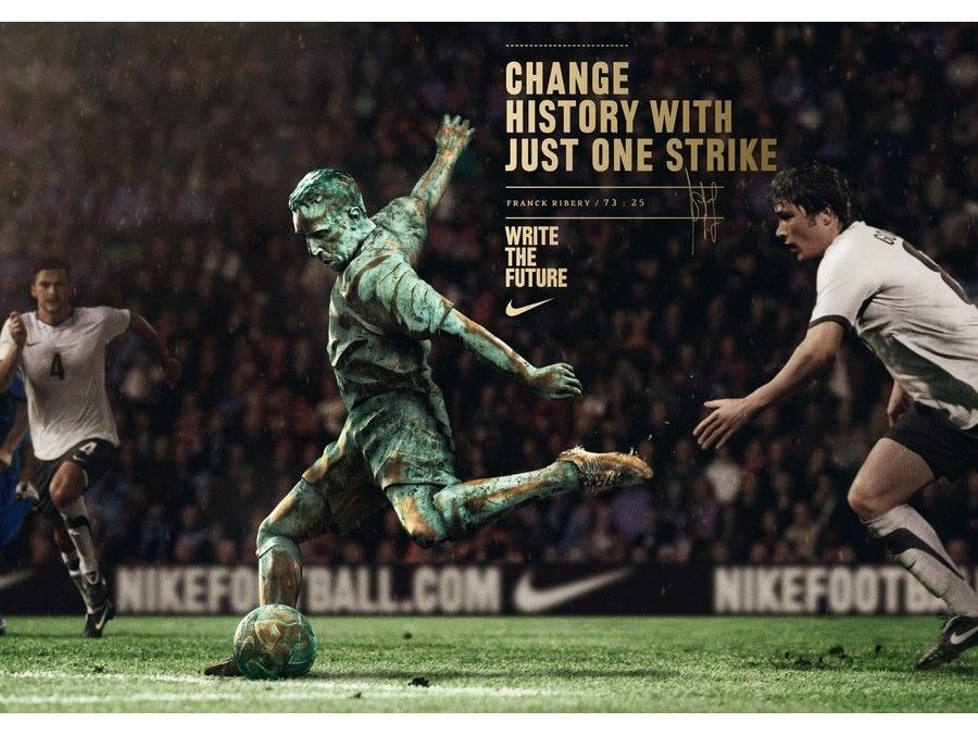
When looking for a colour based image within football, I have concluded my research to follow the pattern of footballers and images produced to display a footballer as a whole. After my research, I had discovered a set of poster produced by Nike which all followed the same criteria, this criteria being the range of football hero’s with iconic moments. The set included4 posters created in May 2010.

The poster I had decided to use was the “Frank Ribéry, change history with just one striker” poster. This piece produced by Nike displays the legendary French player Ribéry scoring a goal against the German national team. The reason I have chosen this to represent colour is based of the pallet and selection of colours chosen by the authors and designers. The green and the gold provide the viewers to visually see that the player has been turned into a statue, displaying the legacy that he had as a player. Areas such as the boot and knee symbolise the ability Ribéry displayed on the field as the creators have turned these key areas to golden, which may be one areas that viewers are first attracted to.
Not only has the main feature of the poster been designed with a good colour scheme, but the background and surrounding items being selected perfectly. In my opinion the background of the image such as the fans and the two players show cased alongside, have been designed with a darkened colour palette in hopes that the first area the viewers will look towards is the centre point, which is Frank Ribéry. The unclear and darkened crowd in the background makes way for the main focus point to be seen.
Bad design.
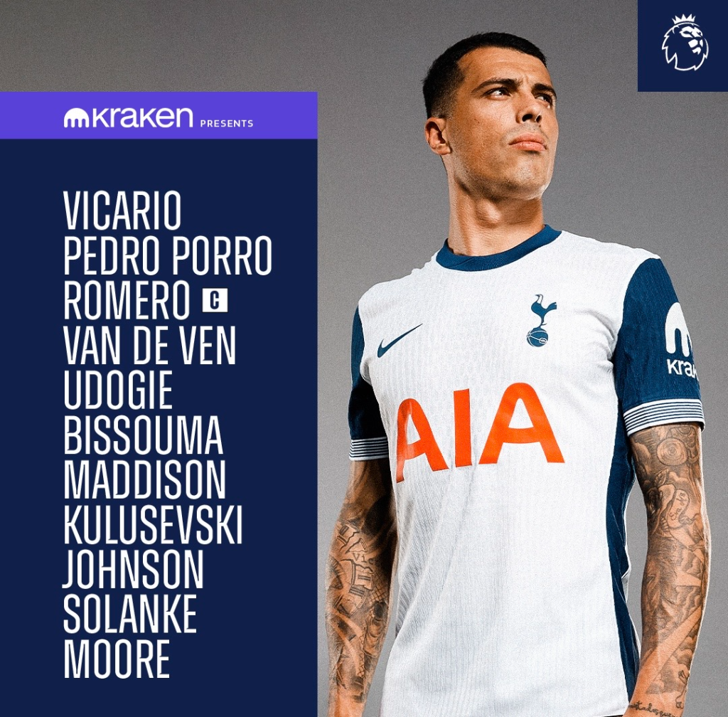
The image that I have selected to display a bad representation of colour in the world of football was a team sheet line up produced by Tottenham Hotspur for their recent game. The image is a simple list with a few colours placed around, such as the background and the squad names themselves.

The reason that I have selected this image is down to the choice of colours. Football is a sport which is supposed to excite the fans, meaning that when teams post media such as line ups, this can help when building up more excitement and determination for the viewers. However when designing media such as the one selected, the posts are boring and lacklustre which provide no character and in most cases, are disappointing. When creating my own version of a team sheet line-up, I am to make the design vibrant, whilst also implementing the set colours of the premiere league (white green and purple). With the idea that the line up should be designed to create an eagerness for the upcoming match.

When planning out how I would implement a range of colours into my own version of the team sheet line-up, I had mentioned the idea of using the set premiere league colours. However after experimenting with a variety of colour pallets, my decision was to use a range of colours which match up nicely with Tottenham Hotspur and the home kit which they wear. To go alongside the colour pallet selected, I opted for a vibrant image which displays the teams shirt, the image itself showcases a snap shot of two players celebrating a goal which I believe is an addition to the excitement factor. To finish the process of creating my image, I added the small detail which is the premiere logo as in my opinion this integrates well with the final photo.
References
Figure 1. Poster commissioned by Nike. Authors and designs – Pierre Janneau and Chris Thurman. Designed in May 2010. Nike: Write the Future, Robinho, Write the Future, Drogba, Writ… • Ads of the World™ | Part of The Clio Network. (Accessed 14th October 2024).
Figure 2. Image created by Tottenham Hotspur. (27/10/24). Uploaded to X/Twitter. https://x.com/SpursOfficial/status/1850519349120868535. (Accessed 27th October 2024)