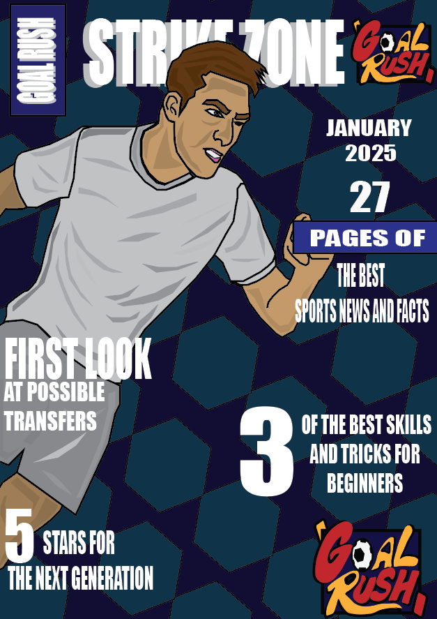
My first cover design is designed in the fashion of what most magazine front covers look like. When planning my design I gained ideas and thoughts based on the same factor of which most magazines all included, the front cover always has a range of headlines which can be used to grab the attention of potential customers, with the customers in my scenario being younger children. With this in mind, I wanted to create headlines which children will get excited about, such as easiest skills and football related facts.
The design itself is a simple cover image which displays a football player, within a pose which is common for when the player is out on the field, the more effective covers are simple yet are able to gain the attention of the customers, I tried making this cover with a range of players and items which I had designed, however I realised this idea caused the cover to look untidy and possibly too complex.
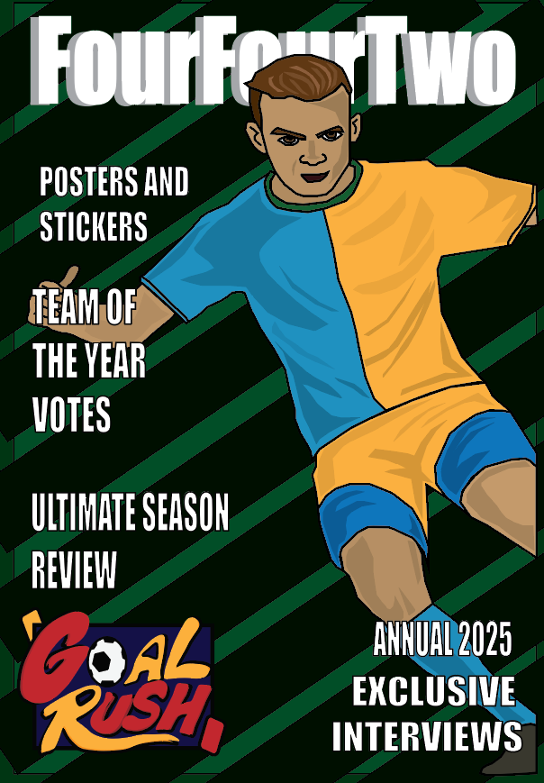
My second cover design is similar to the first one in which I produced, just like the first one, this cover design includes a football player in the position in which looks like he is running whilst playing a match. My decision for the background design is based of wanting the main factor to stand out the most. As the players kit is a bright shade of both blue and yellow, I wanted to use a darker shade colour to make sure that the player is the outstanding factor and the main focus when people see my cover design.
The chosen text around the design are factors which may intrigue the potential customers such as the posters and stickers which are aimed at for the children who may thinking of buying the magazine. The name choice of “FourFourTwo” is a reference to the football formation which is most commonly used, this I believe is a fitting name for something such as a sports magazine. The design itself is yet again in the form of a cartoon comic book style, when eating everything related to my magazines I aimed and made a various number of sketches where the player is seen in this comic style.
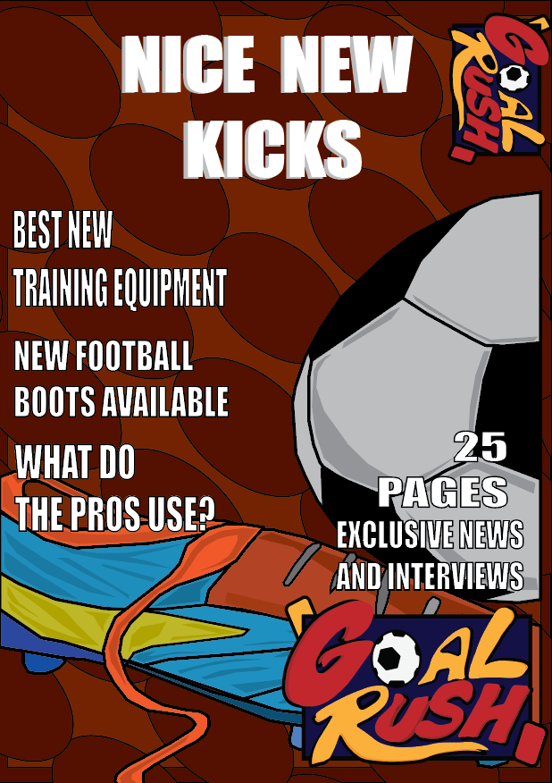
My final design for my cover image is a magazine which I based around the football equipment instead of focusing on a certain player and topics relating around the players which feature in the magazine. Instead I have focused on different ideas such as the boots that players use and some of the equipment which is available for younger children to use.
As this magazine issue was to be based around boots instead of the players I opted to create a design which displays a ball and a boot alongside each other, the colour scheme I chose helps to make the boot stand out and be more eye catching for the children who may see the cover. The colour scheme and design for the background, the idea came from the boot as most of the colour that appears is an orange, so implementing a dark orange background causes all of the design to fit in nicely together.
All of the designs I have used are mine and do not belong to anybody else. These designs have originated from a set of sketches I have created.