Design 1
My first attempt on creating a typographical name logo, my intention was to create a simplistic design which portrays my idea in a clear way. To do this, I wanted to align letter which correspond within my name, therefore I have aligned the “E” in my first name, with the “E” in my second name. This is my first attempt at a typographical name logo and after learning more skills, this will progress. The reasoning for my selected colour scheme is simple, I think both the blue and yellow combination are a visually pleasing design and work well with each other. I chose the grey background in order to make the main text the main attraction, causing no issues with reading the text.
Design 2
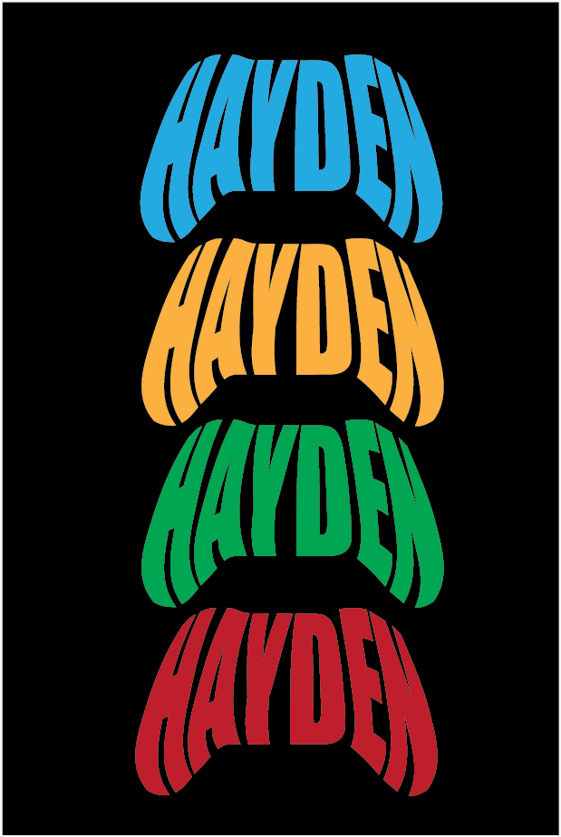
When designing the spread for my second typographical name logo, I aimed to implement something which its a main factor in my day to day life. I had made a few attempts previously, which included a Large variety of hobbies which describe me and that I enjoy, however my final decision was to revert to something simple and. easily recognisable. To do this, I created a quick sketch outline of an XBOX controller, which I believe is a simple yet effective conclusion.
After my name had been moulded into the shape of the controller, this was then copied and pasted an extra three times, each with a different colour. Each colour selected displays a range of colours which can be found within the XBOX controller, such as green, blue, yellow and red. The font selected is a perfect selection, this is due to the size and shape it has when moulded into the final shape, other fonts I had tested did not create the same aspect and idea that I wanted to achieve.